This case study highlights two public engagement projects supporting municipal and infrastructure initiatives in the Greater Toronto Area. I designed clear, accessible visual materials for public meetings and outreach events to communicate complex technical information to residents, stakeholders, and government representatives.
The projects included visual design for public information boards, large-format banners, interior signage, and community outreach materials.
GOAL
The goal was to simplify complex infrastructure information and support effective public engagement while aligning with municipal branding and accessibility standards.
KEY SKILLS DEMONSTRATED
Information Design for Public Communication
Content Simplification & Visual Hierarchy
Large-format Event & Exhibition Design
Wayfinding & Environmental Signage
Accessibility-focused Design
Government Branding & Design Standards
The Challenge
Infrastructure and environmental initiatives often involve complex technical information that can be difficult for the public to understand. The materials needed to communicate key messages clearly to a broad audience while remaining readable in large public spaces.
Designs also needed to follow government branding guidelines and accessibility standards, ensuring information was easy to scan, visually balanced, and understandable to non-technical audiences.
DESIGN APPROACH
Understanding the Audience
I worked closely with project teams to understand the technical content, public concerns, and key messages that needed to be communicated during community meetings.
Content Simplification
Engineering reports, maps, and planning documents were reviewed and distilled into concise messaging, visual diagrams, and structured information suitable for public audiences.
Information Hierarchy
Large-format layouts were designed with a strong visual hierarchy to guide viewers through the information. Headings, maps, icons, and diagrams were organized into clear sections so visitors could quickly understand the project background, impacts, and next steps.
Visual Design & Accessibility
All designs followed municipal or government branding standards, using consistent typography, colour systems, and accessible layouts to ensure clarity and readability in a public event environment.
Tools
Visual System & Accessibility Decisions
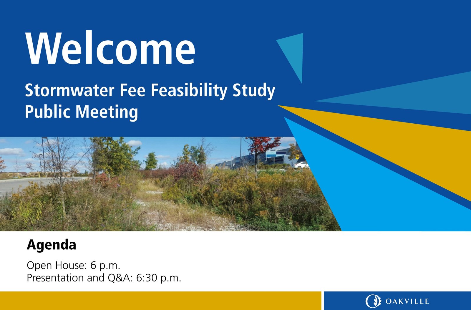
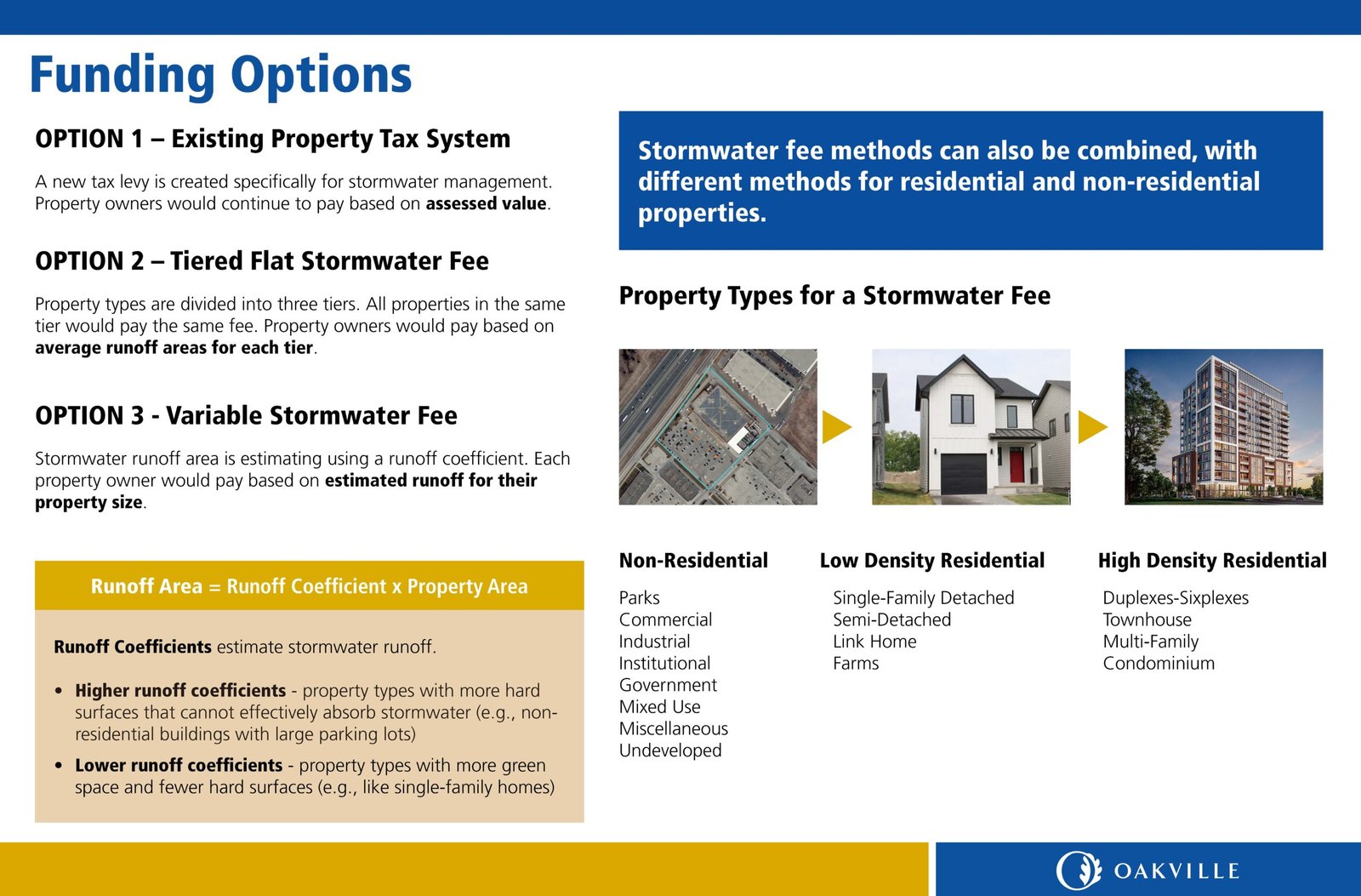
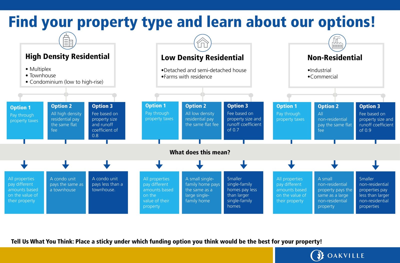
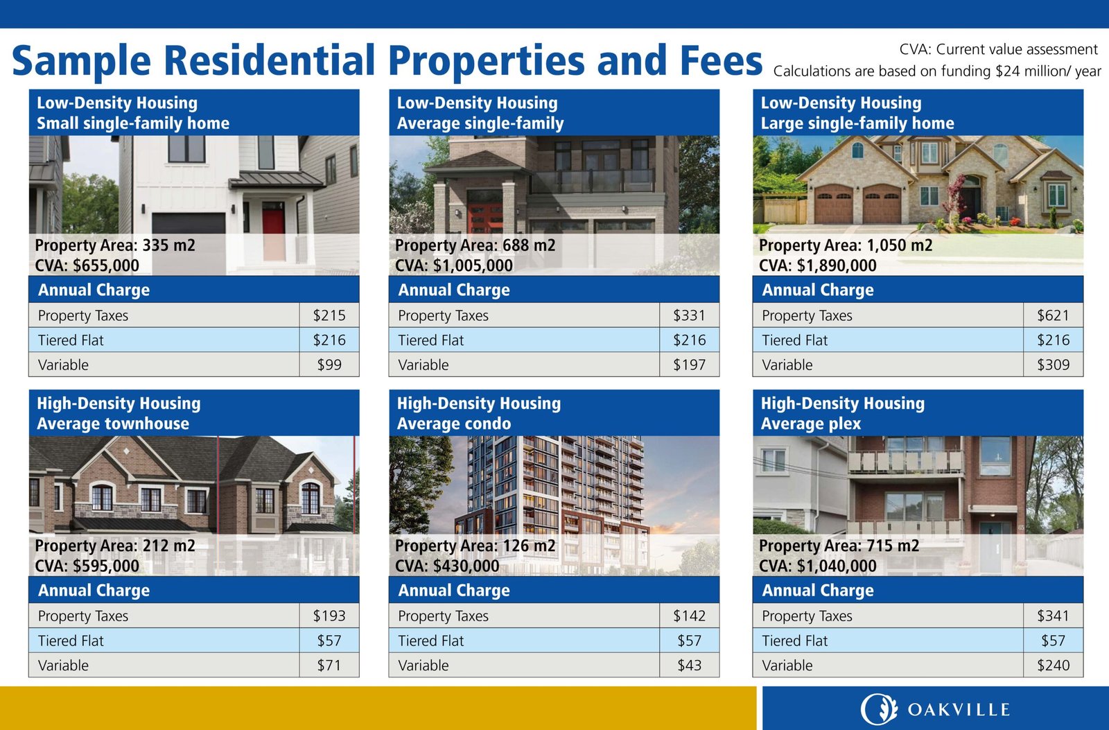
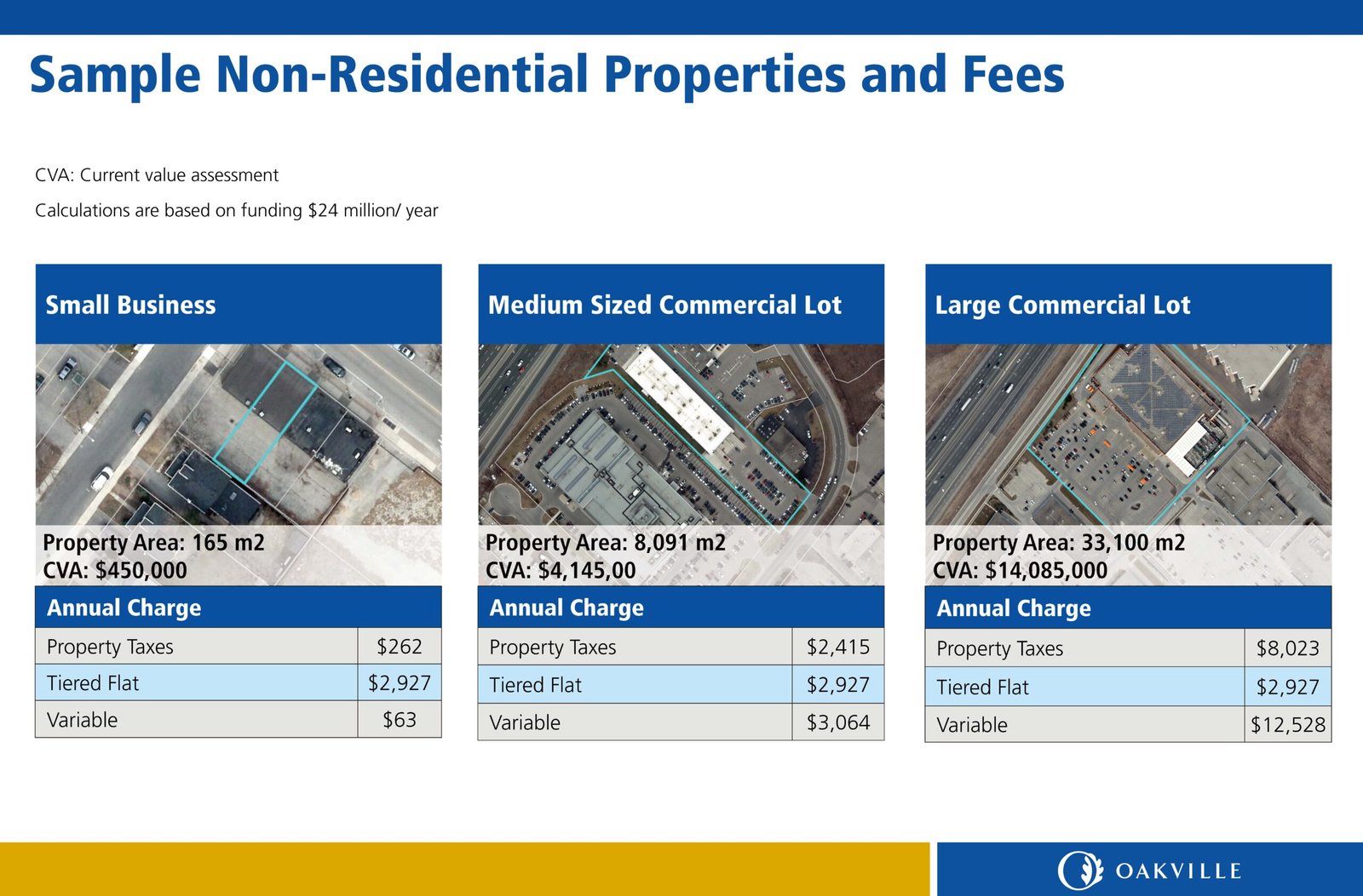
Oakville Stormwater Initiative – Public Engagement Materials
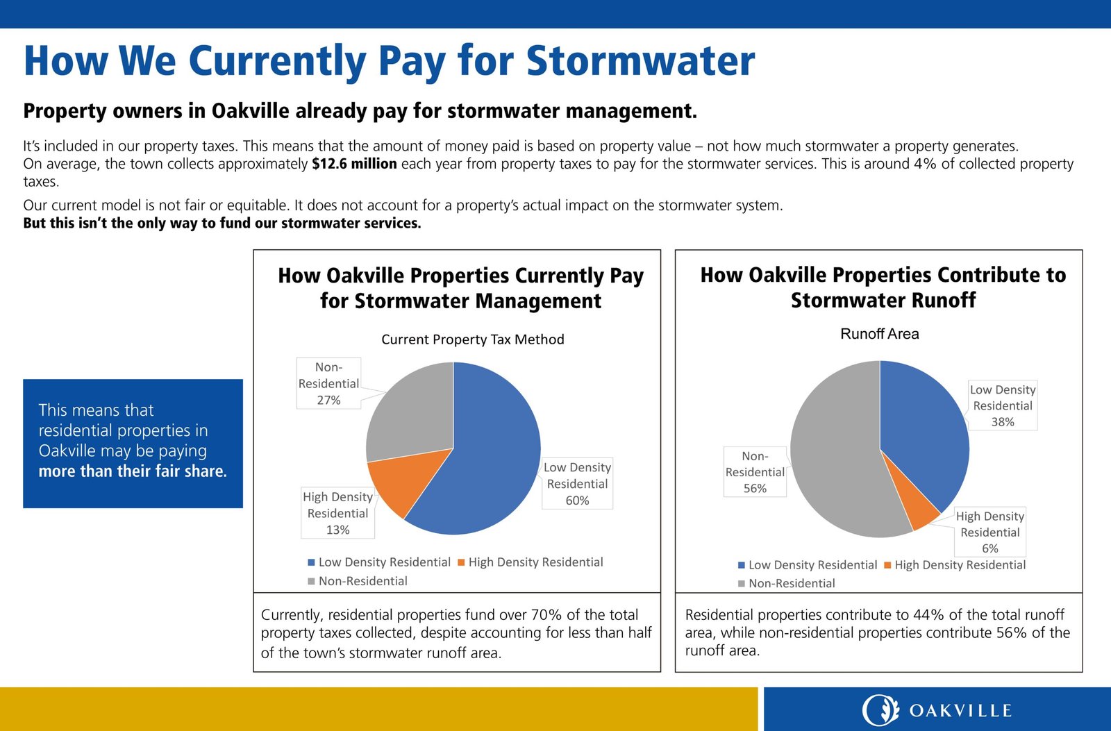
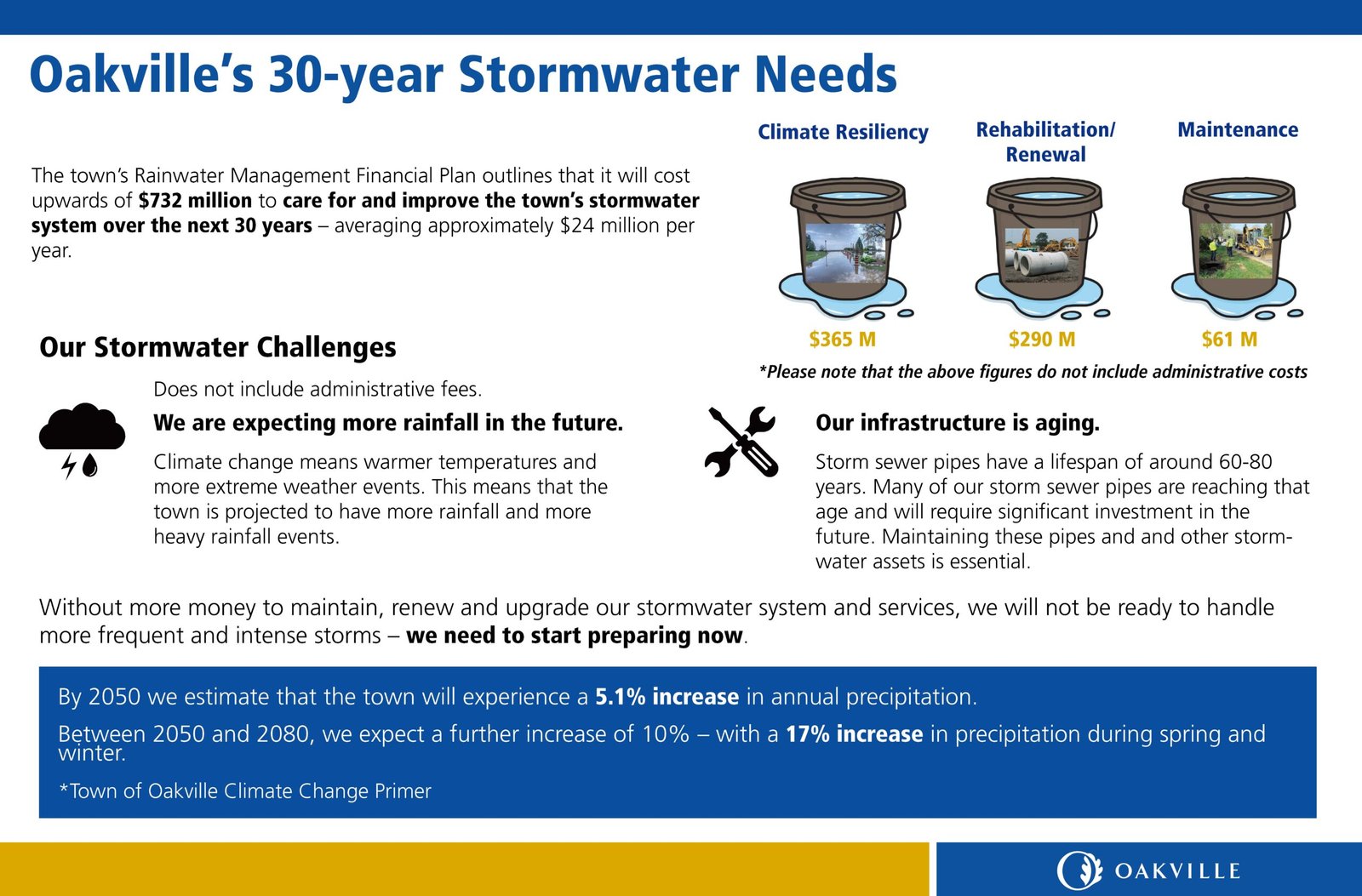
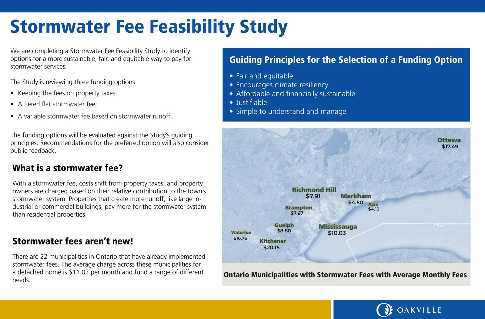
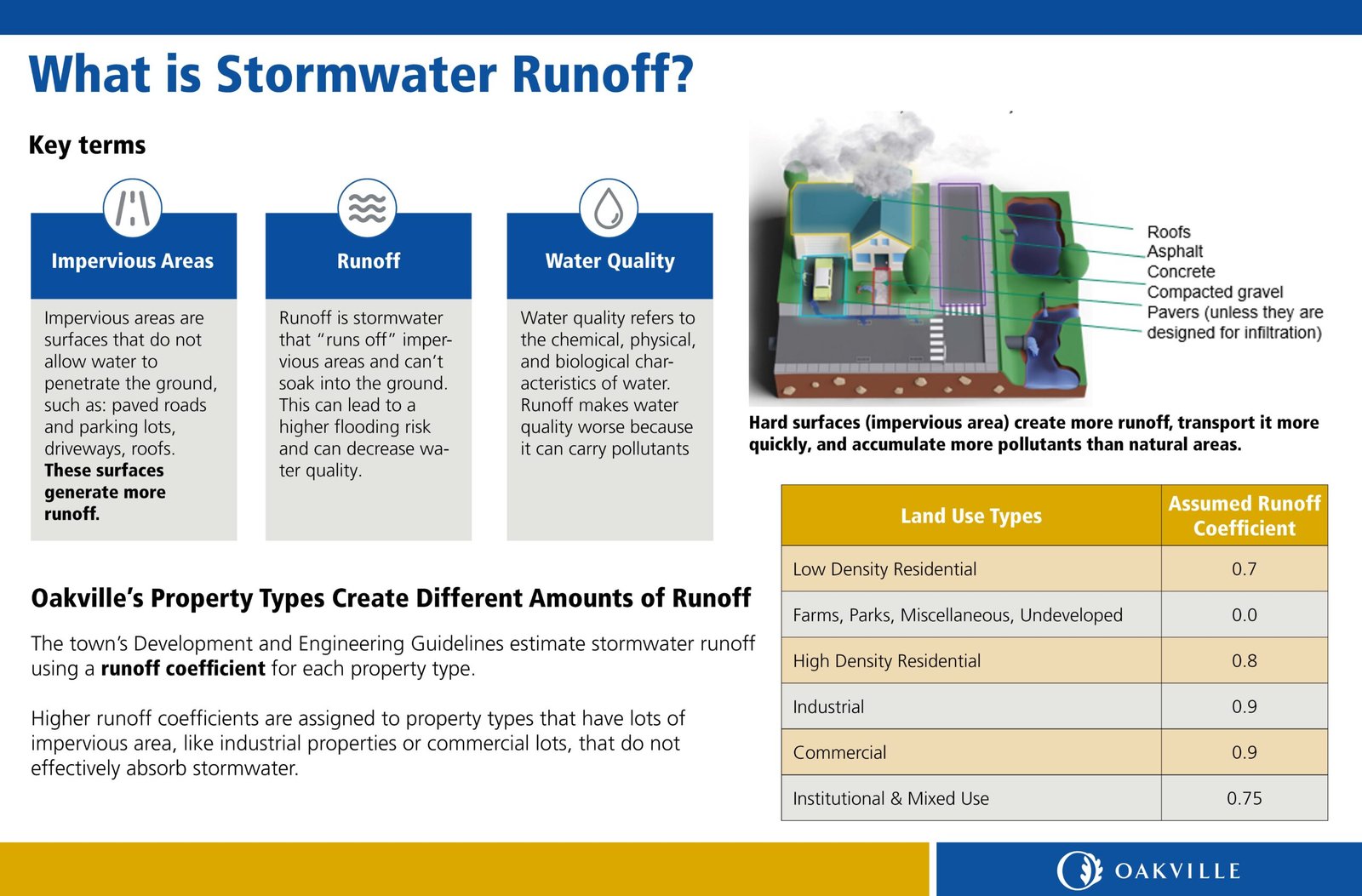
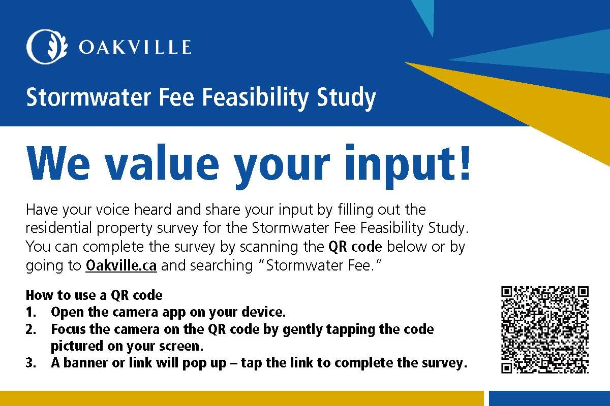
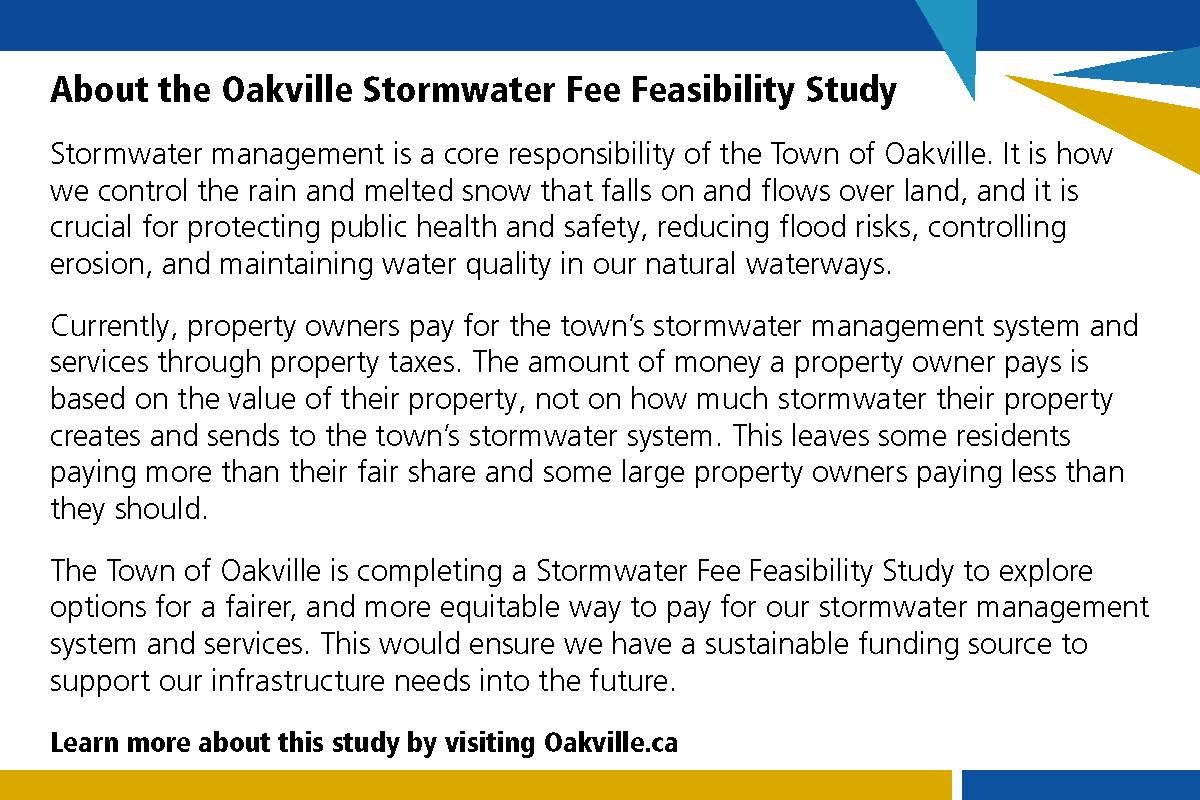
For this municipal project in Oakville, I designed visual materials to support community outreach for the Stormwater Fee Feasibility Study.
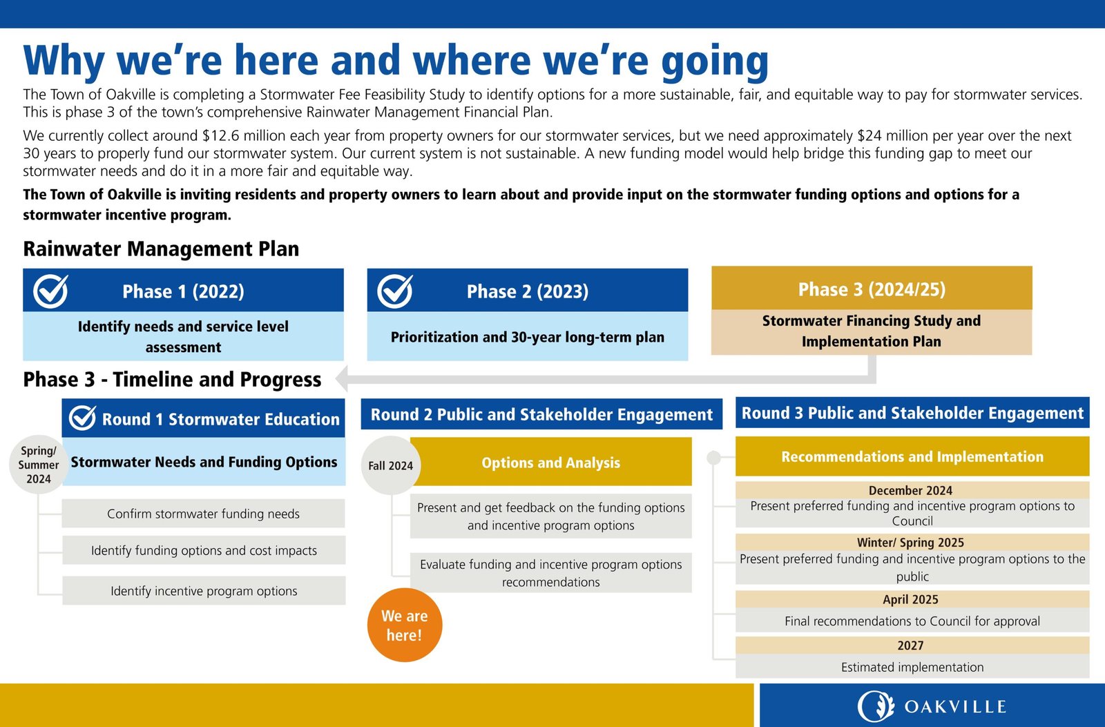
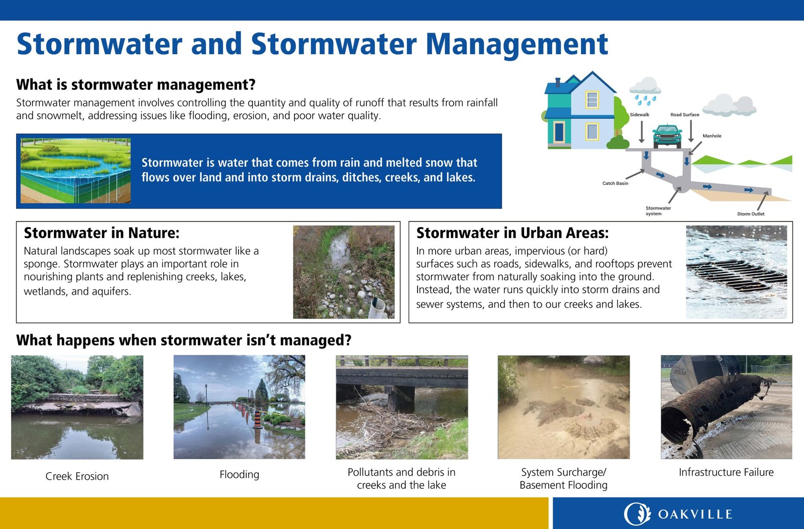
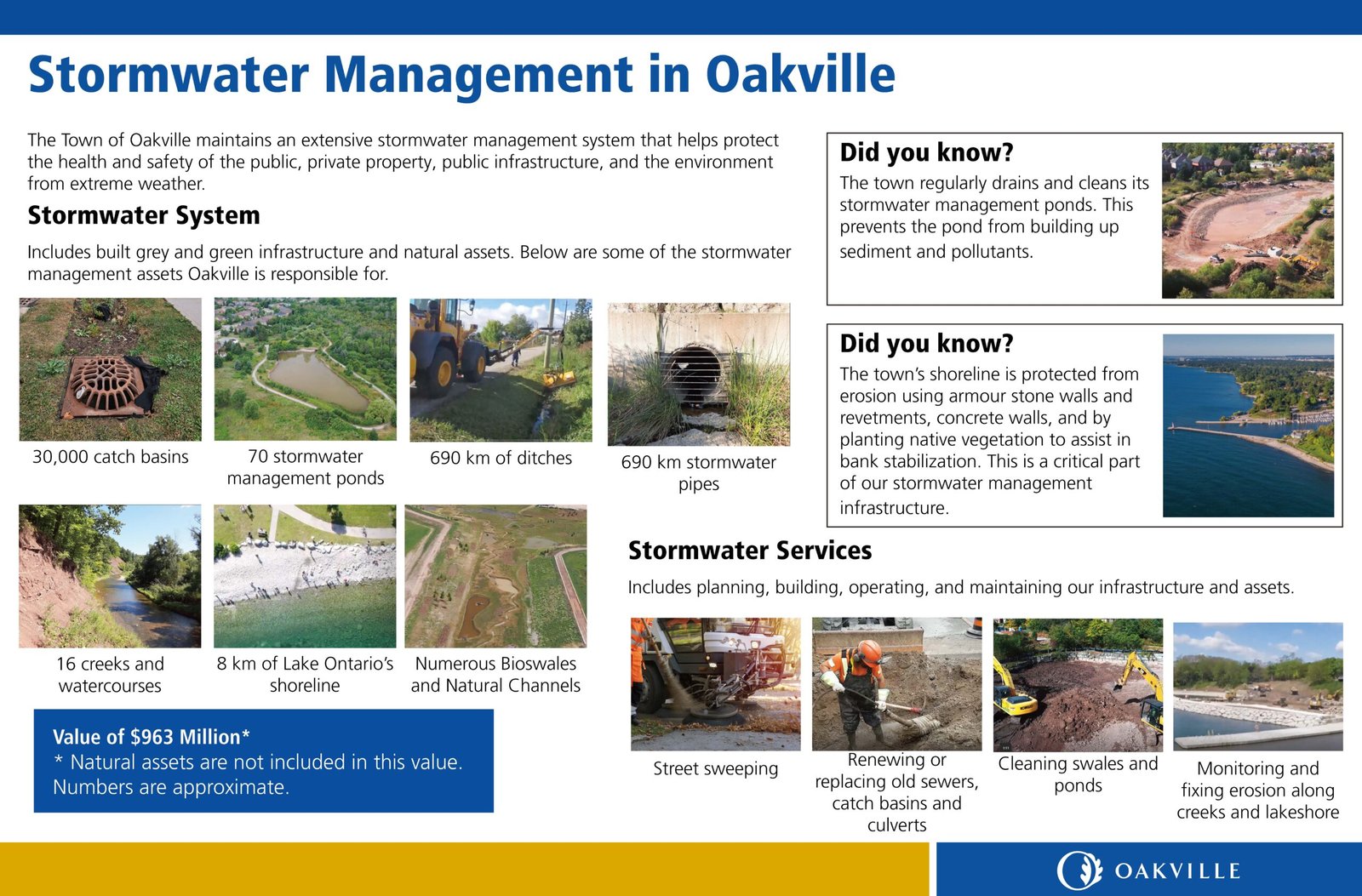
Public Meeting Boards
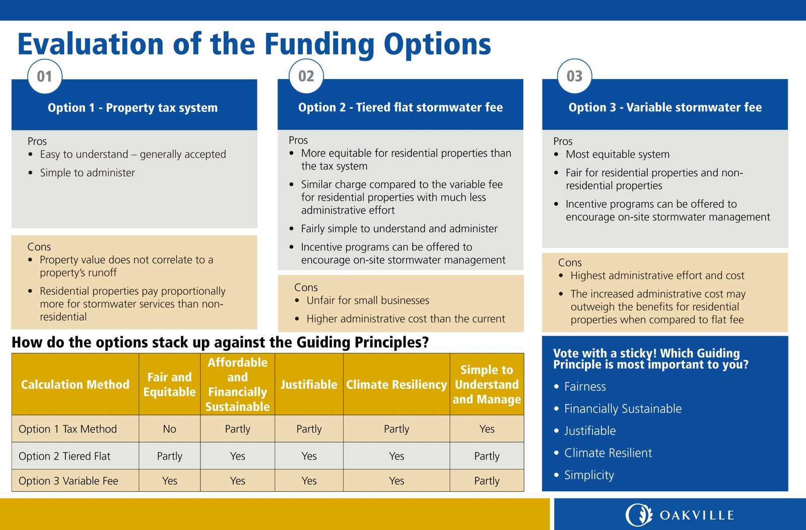
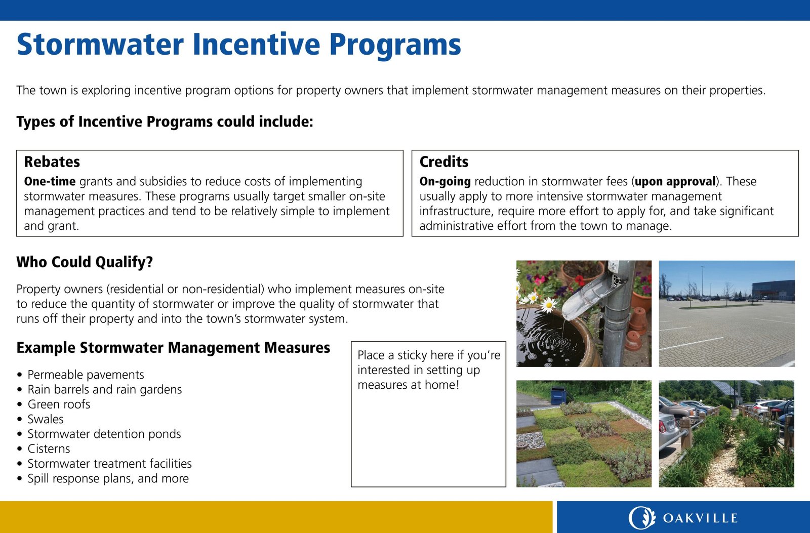
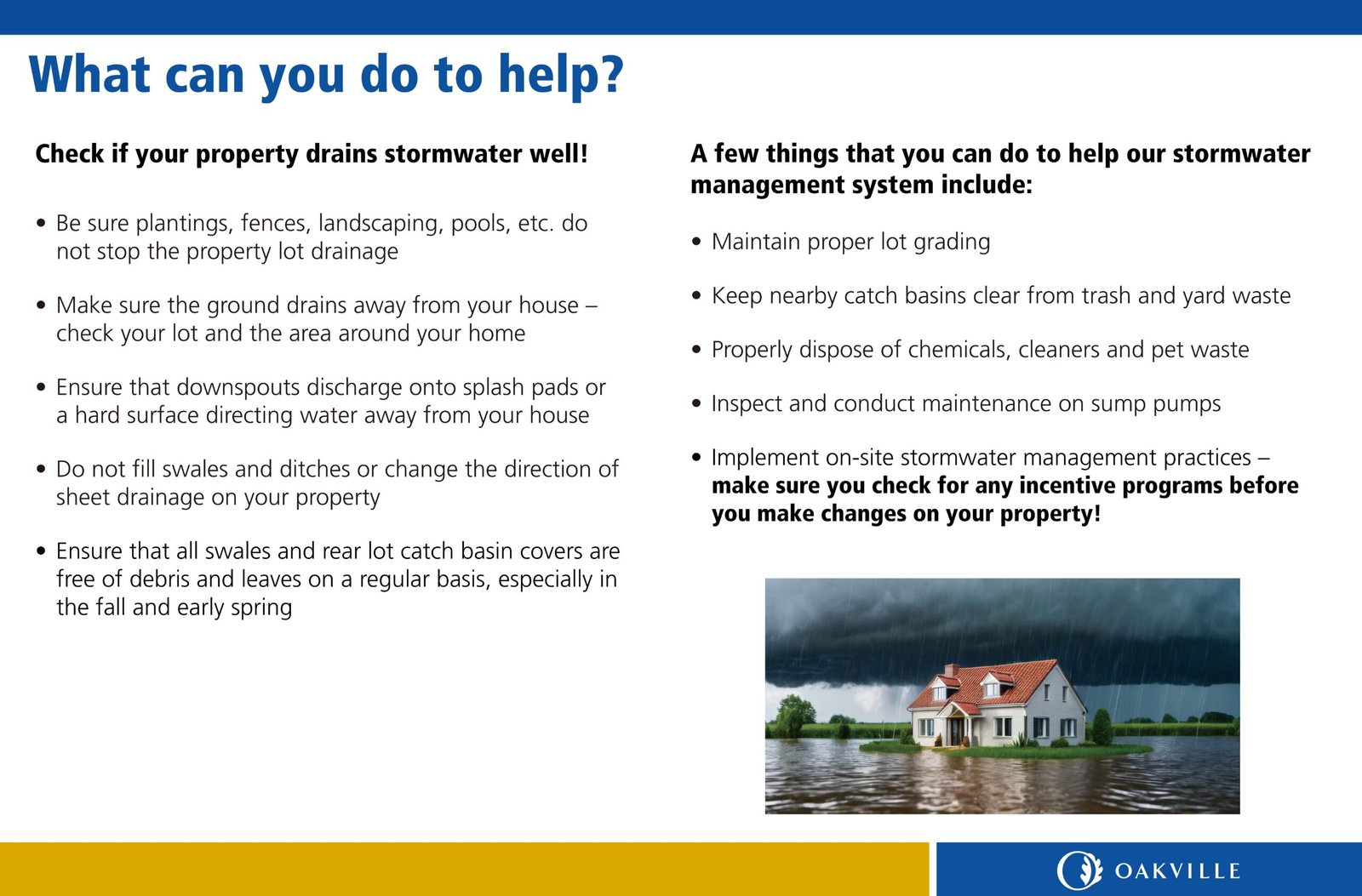
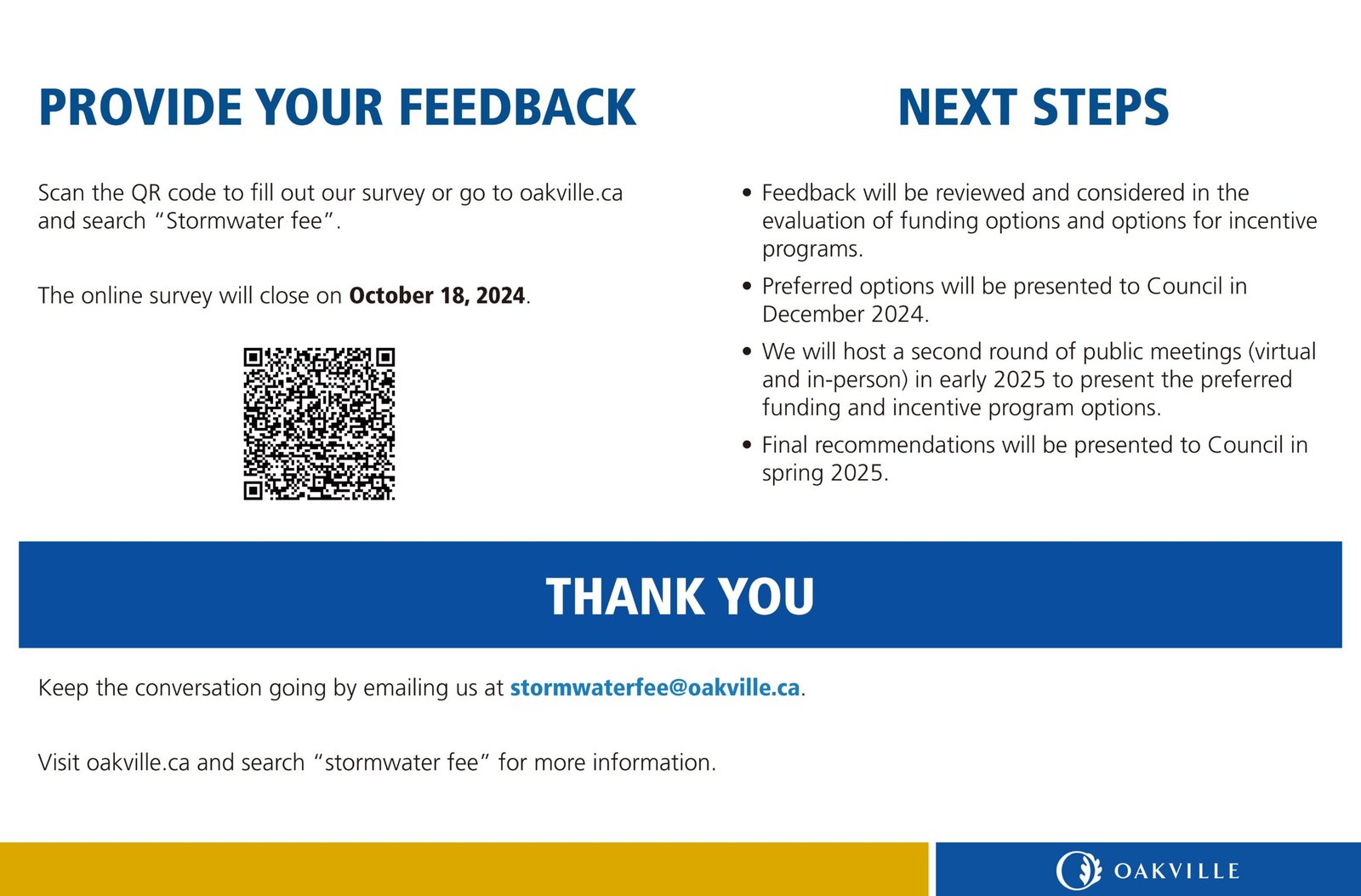
Large-format boards were created to present stormwater system information, project background, and timelines. Technical information was simplified into clear sections with concise text, maps, and visual summaries to help residents understand the initiative.
Community Outreach Postcard
I also designed a postcard to communicate key study information and encourage public participation. Within the limited space, the layout prioritized essential messages and clear visual hierarchy to create an approachable, easy-to-scan design.
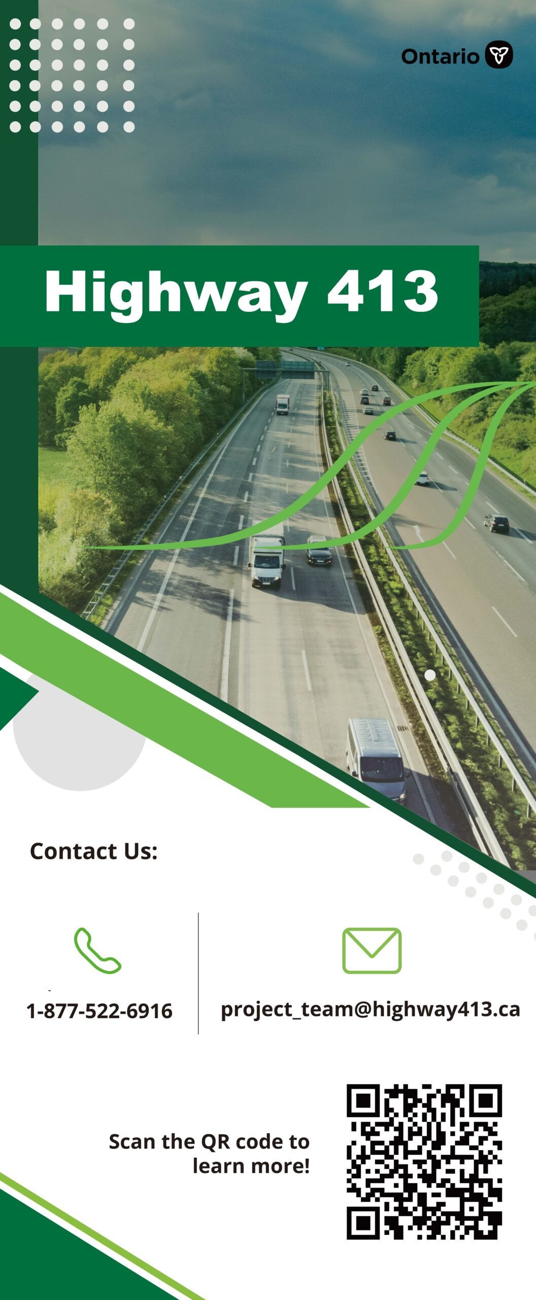
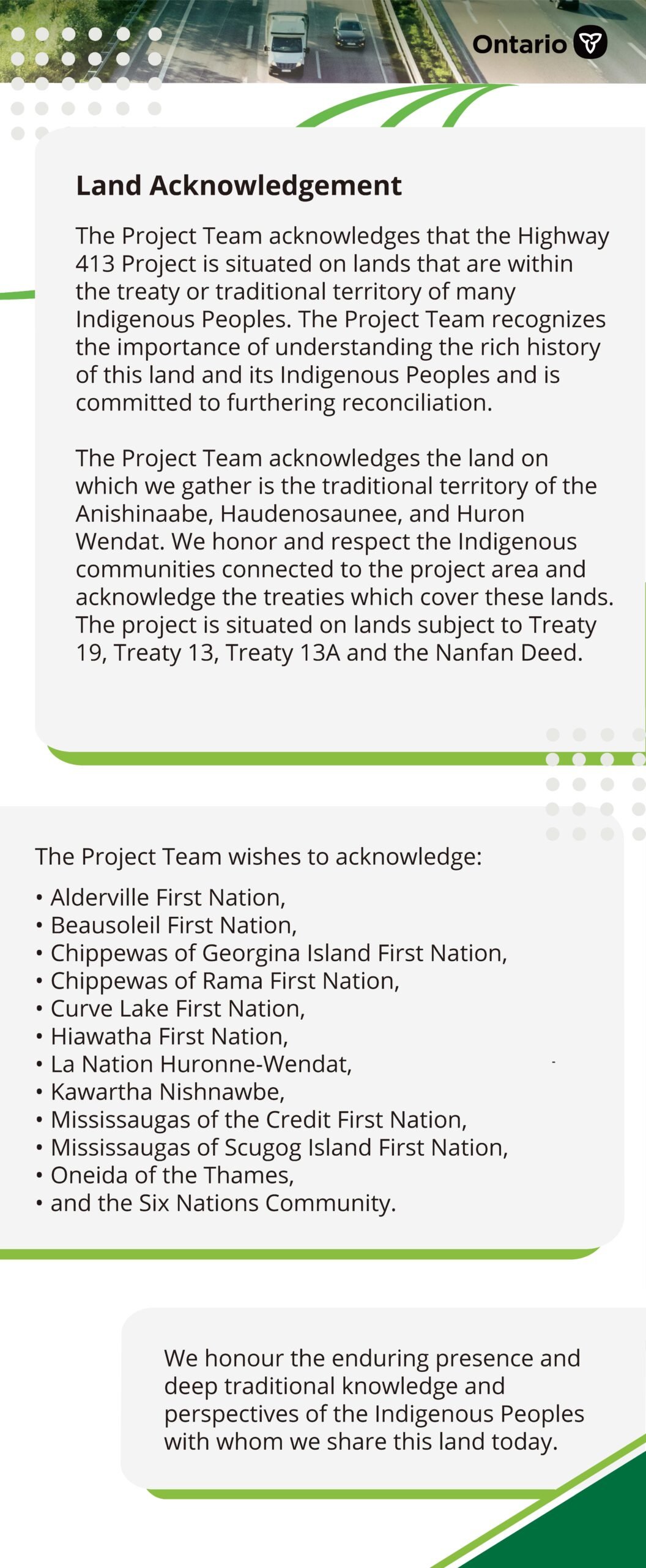
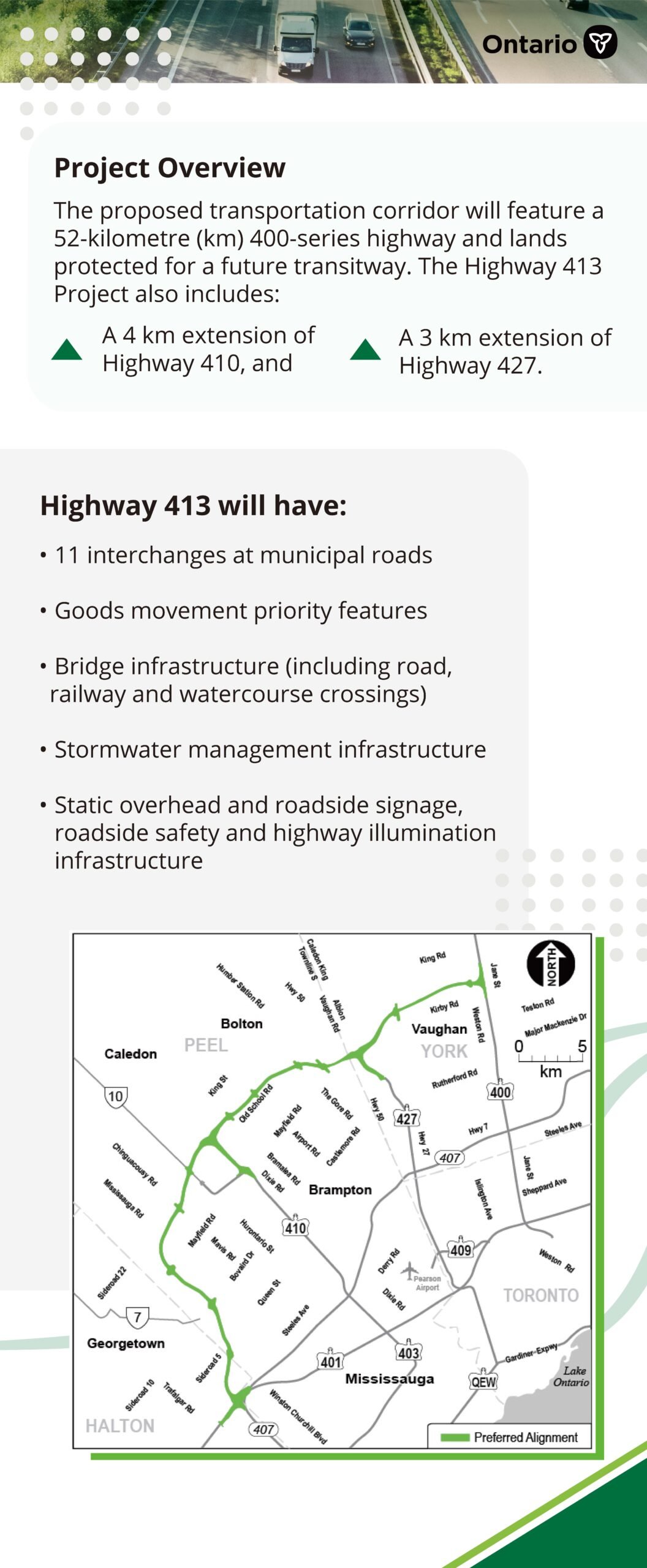
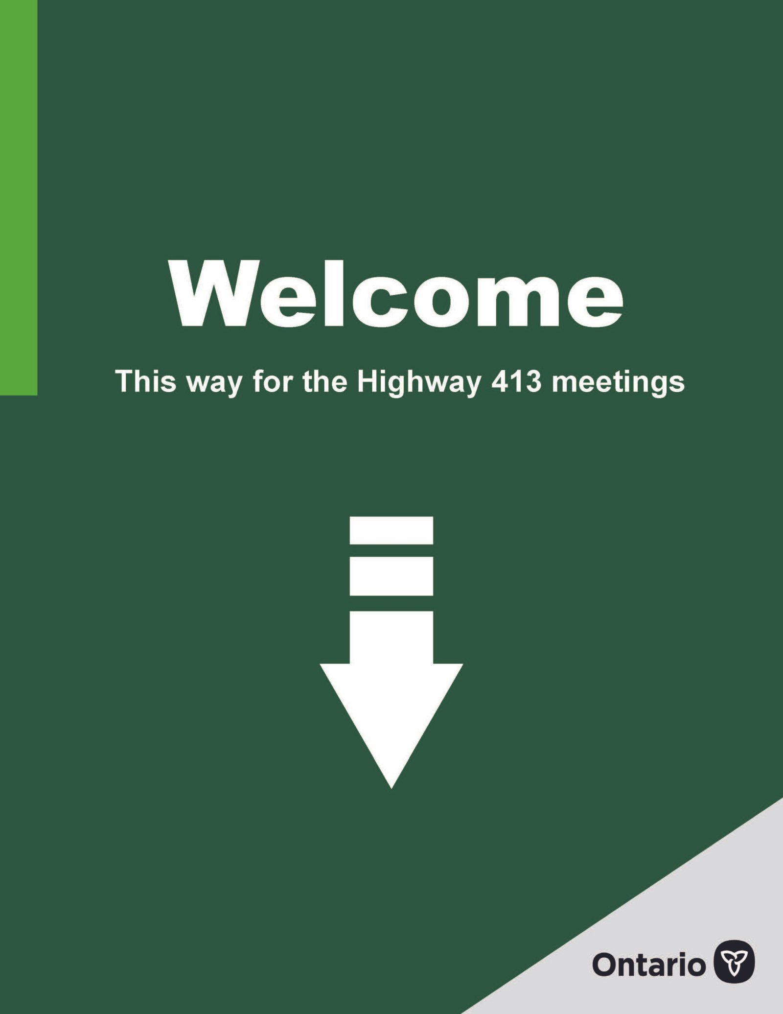
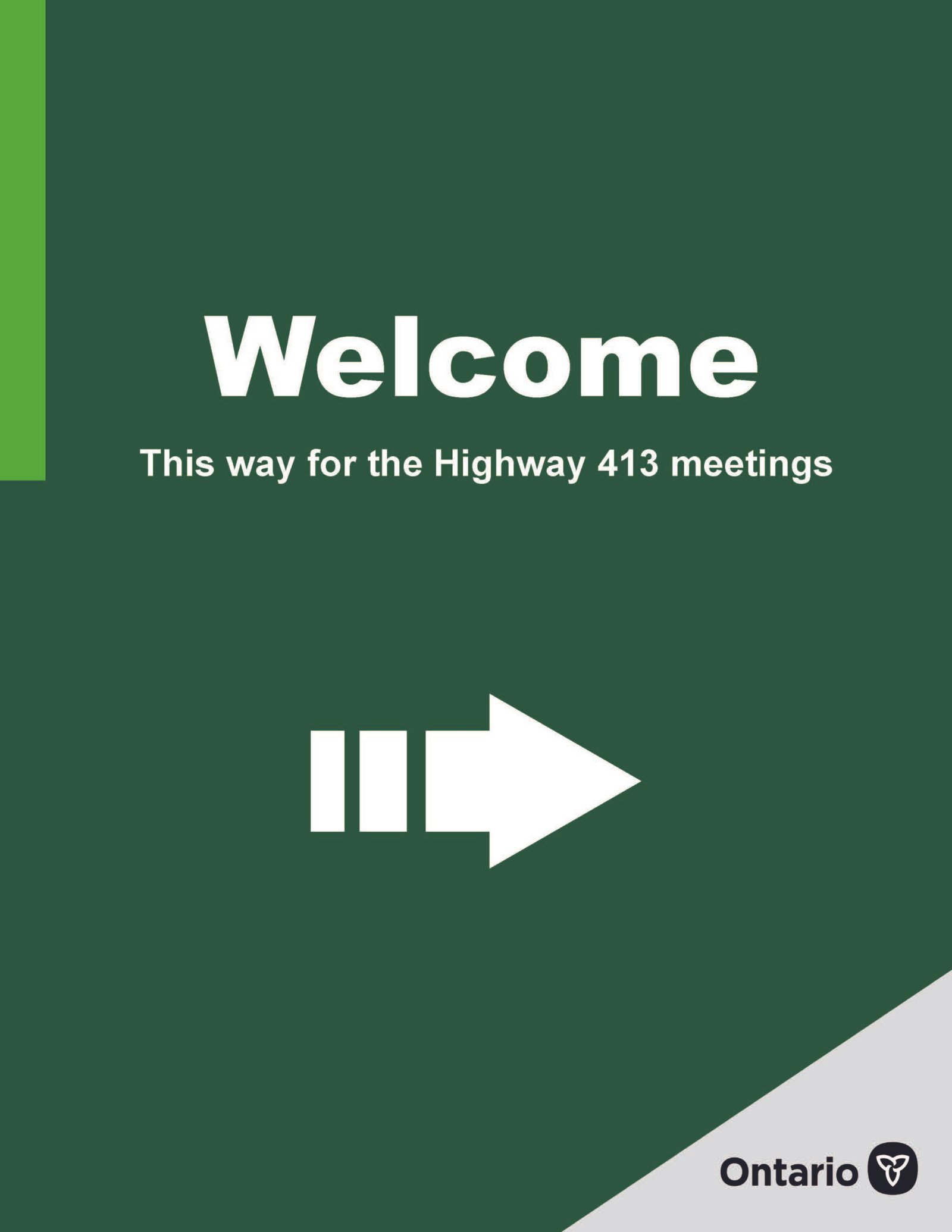
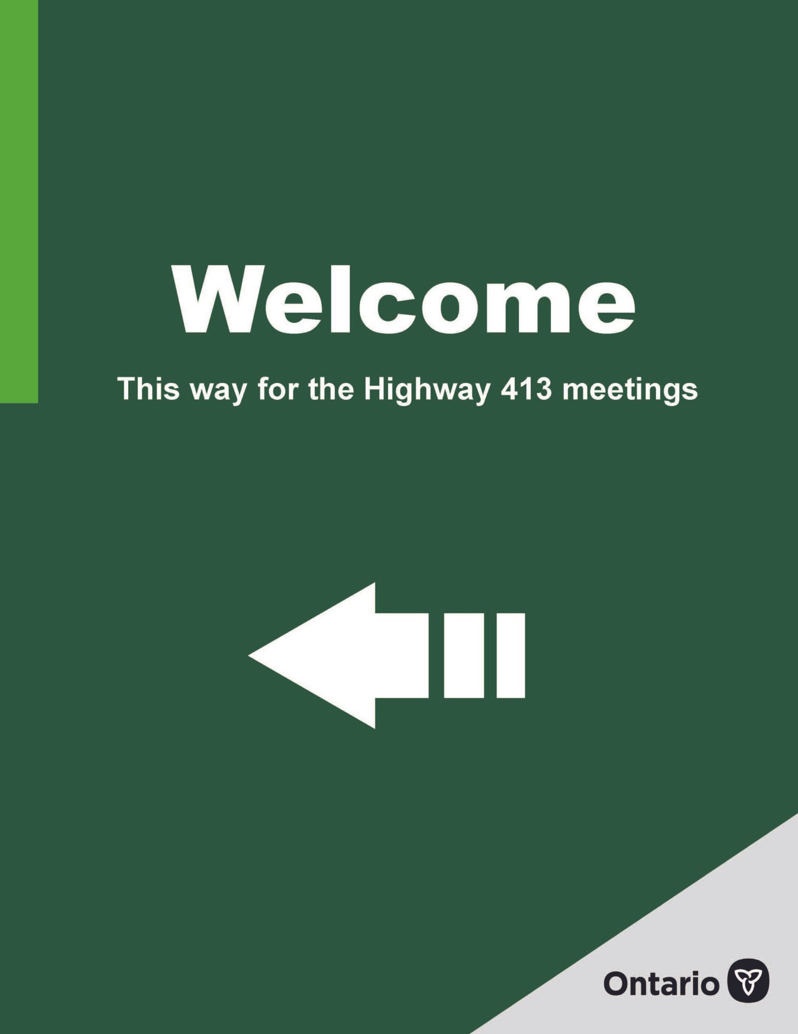
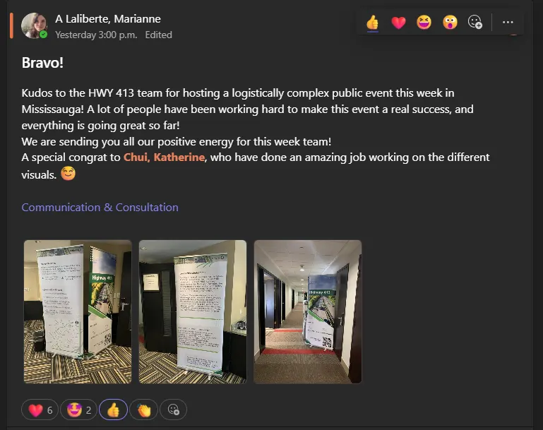
Highway 413 Public Consultation Event
This large-scale public consultation event in Mississauga supported community engagement for the Highway 413 initiative.
Public Meeting Banners
I designed large-format banners that communicated project updates, environmental information, and timelines. Technical content from reports and studies was simplified into visual summaries suitable for quick viewing during the event.
The designs followed branding and accessibility standards from the Ministry of Transportation Ontario (MTO), ensuring clarity, readability, and consistency across the full banner set.
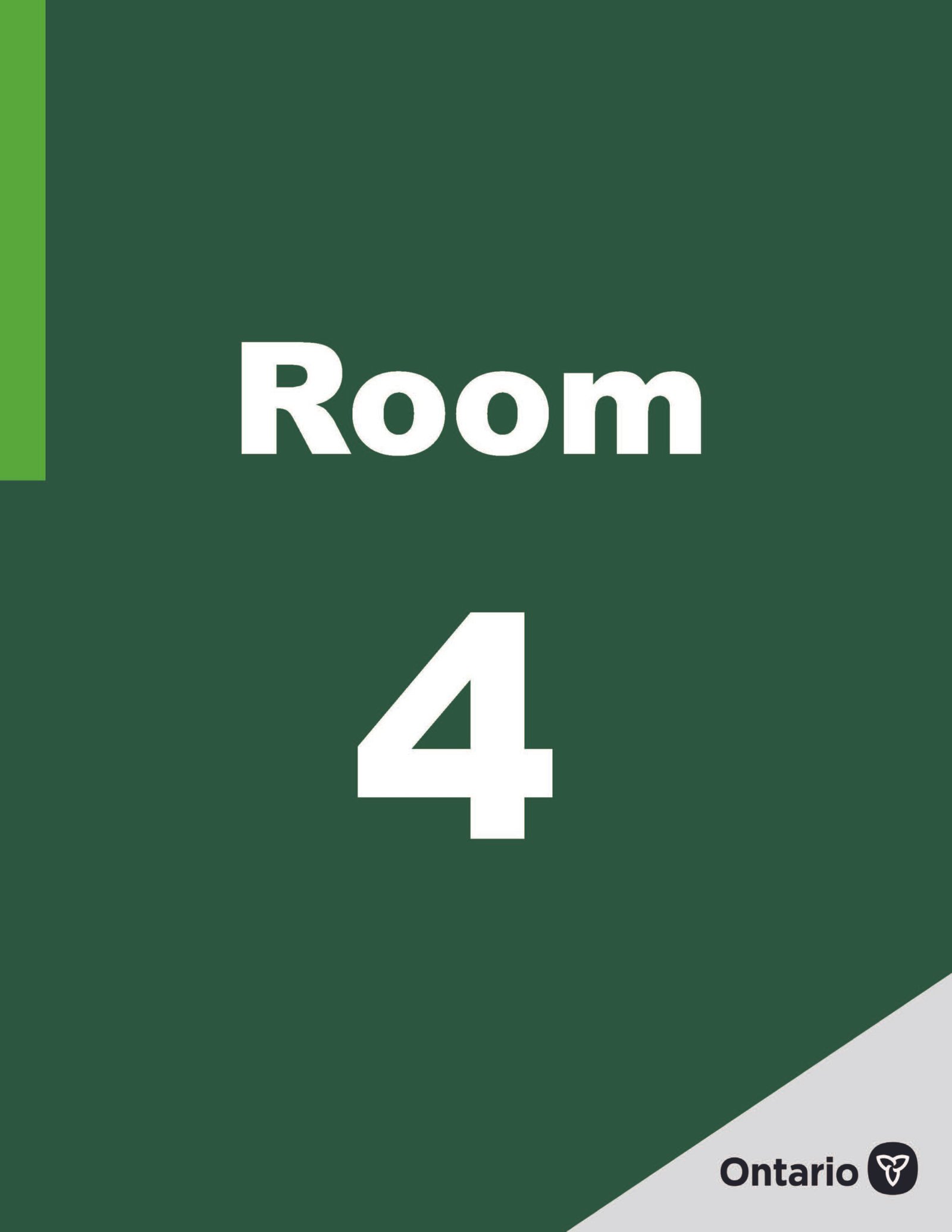
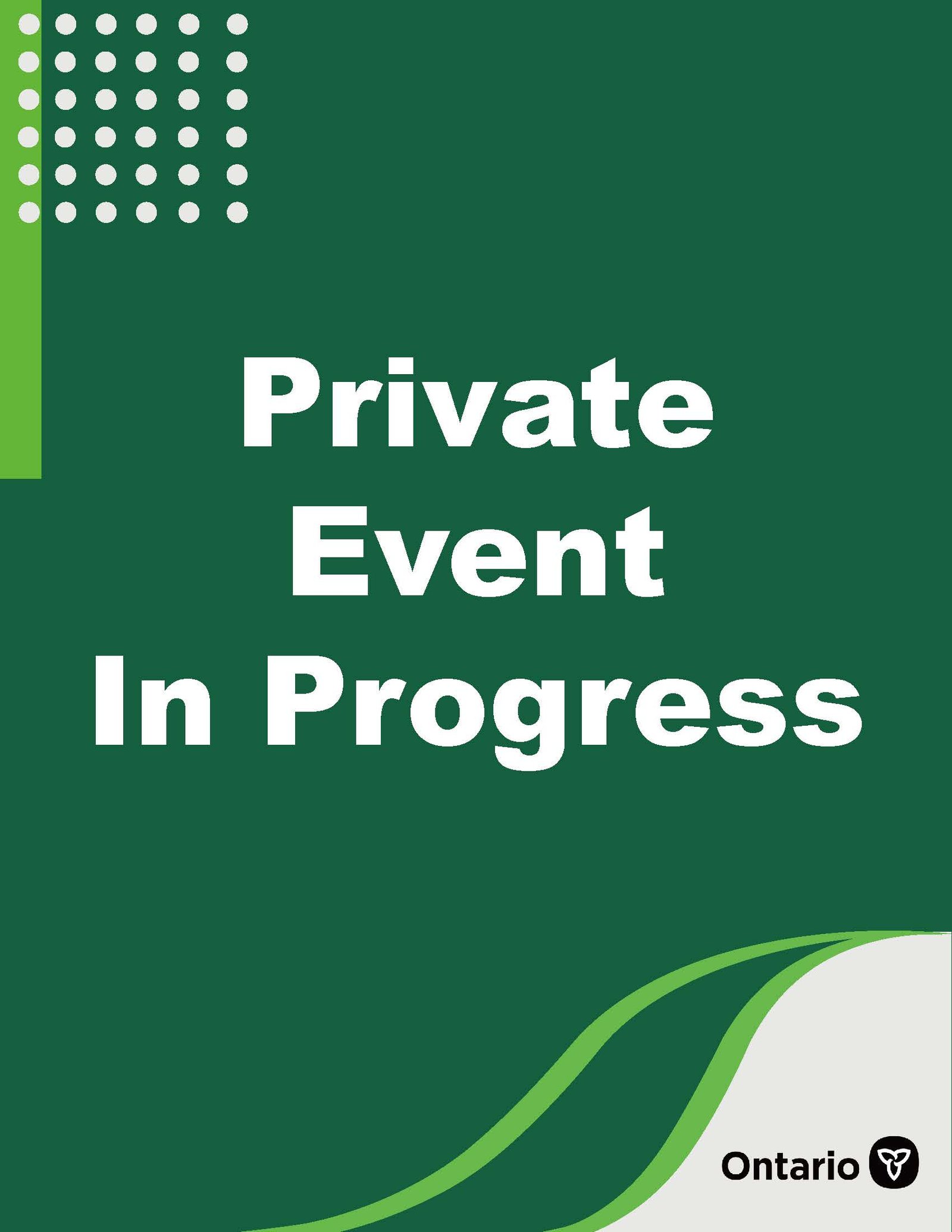
Interior Event Signage
I also designed interior signage, including wayfinding and “Private Event in Progress” notices, to help guide visitors through the event space. The signage used high-contrast typography and clear icons to improve navigation and support a smooth visitor experience.
Outcome
Impact
The final materials helped translate complex infrastructure information into clear and accessible visuals for public engagement events. The designs supported effective communication during community meetings, improved visitor navigation, and contributed to a well-organized consultation experience.