Portfolio case study
Highway 401 Belleville – Kingston Website
A government public engagement website designed in Figma and built on WordPress, aligning with MTO branding and AODA accessibility standards.
CLIENT
MTO / AECOM Canada
ROLE
UX/UI Designer & Developer
KEY SKILLS DEMONSTRATED
Accessibility (WCAG)
Information Architecture
Content Simplification
Stakeholder Collaboration
THE PROBLEM
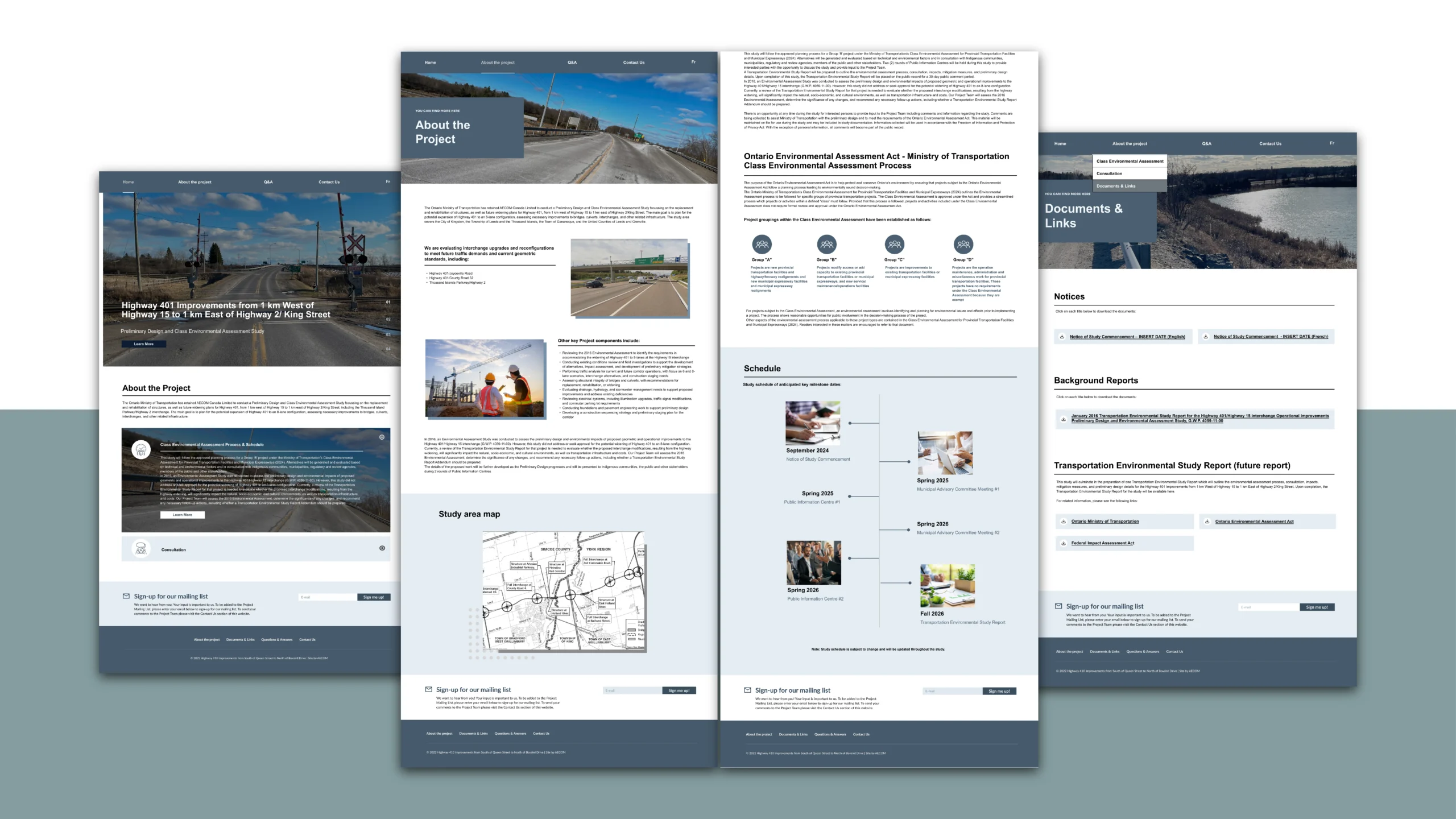
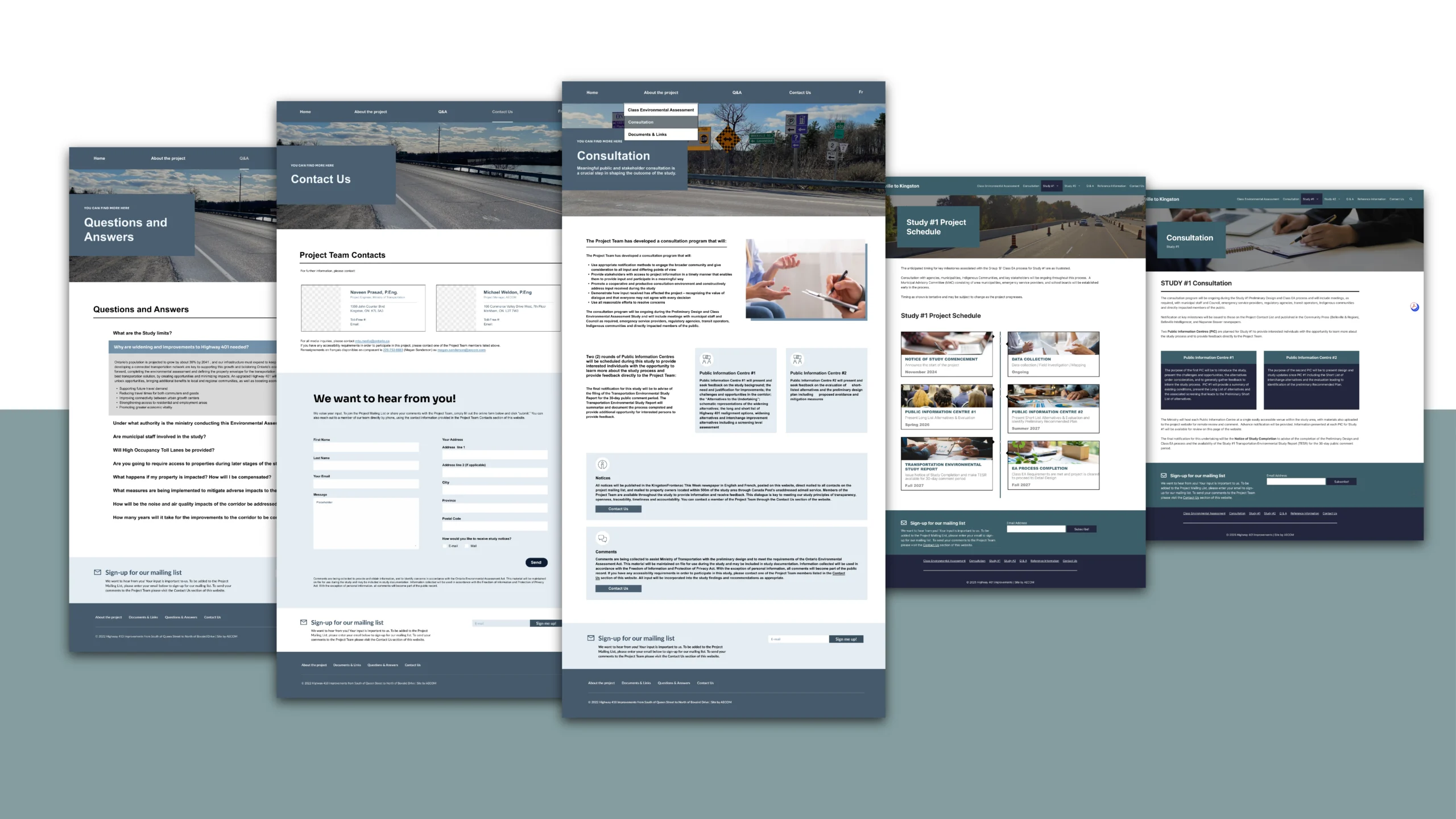
Government infrastructure projects of this scale involve dense technical information, multiple municipal jurisdictions, and strict regulatory consultation timelines. The challenge was presenting two distinct studies — Study #1 (~26 km) and Study #2 (~29 km) — alongside public meeting schedules, project documents, and feedback opportunities, in a way that was approachable, accessible, and clearly navigable for everyday residents.
1 Information complexity
Two simultaneous studies, each with its own consultation timelines, documents, and project schedules, needed to coexist on a single platform without creating confusion about scope or status.
2 Accessibility compliance
As a government-adjacent platform, the site was required to meet AODA (Accessibility for Ontarians with Disabilities Act) standards — demanding careful attention to colour contrast, typography hierarchy, keyboard navigation, and responsive behaviour across devices.
3 Low public engagement baseline
Infrastructure consultation websites often see minimal participation. Increasing awareness of public meetings and making it easy to subscribe and submit feedback were core goals from the outset.
Design process
Our client liked the brand standard I created for Highway 413, so this time, rather than starting from scratch, I drew on the MTO design system I had established through previous projects, adapting and extending it to fit the dual-study structure of this corridor. This continuity ensured visual consistency across MTO’s public engagement portfolio while allowing me to focus design energy on solving the specific structural challenges this project presented.
Tools
System & layout
Rather than starting from scratch, I drew on the MTO design system I had established through previous projects, adapting and extending it to fit the dual-study structure of this corridor. This continuity ensured visual consistency across MTO’s public engagement portfolio while allowing design energy to focus on the specific structural challenges this project presented.
Card-based layouts formed the backbone of the content architecture. Each category, Studies, Reports, Public Meetings — was surfaced through visually distinct cards, allowing users to scan and self-direct to relevant content, reducing cognitive load for residents seeking specific consultation materials.
AODA compliance & cross-device refinement
Ensuring the site remained responsive and accessible within WordPress while meeting AODA standards was an ongoing constraint throughout the project. I refined hierarchy, typography, and spacing in Figma before any development began, treating the design file as the source of truth for accessibility decisions, not an afterthought.
Each component was tested for readability and interaction clarity across devices, with attention to colour contrast ratios, focus indicator visibility, and label legibility. Interactive states were validated to meet WCAG-aligned AODA requirements before launch, ensuring the platform was usable by all residents regardless of assistive technology or screen size.
Result & Reflection
Scalable design system
Extended an MTO design system I originally built, demonstrating scalability across multiple government infrastructure projects.
AODA compliance
All components tested for contrast, keyboard accessibility, and responsive readability, meeting government accessibility standards.
Participation-first UX
Card layouts and a prominent sign-up banner created clear pathways for residents to engage with public consultation opportunities.