UI/UX Designer: information architecture, wireframing, responsive layouts, visual design, accessibility considerations, and content organization.
TEAM
Communications team, project managers, developers, and transportation stakeholders.
GOAL
Help the public understand a complex infrastructure project and easily find updates, meetings, and ways to participate.
OUTCOME
Delivered a clear, mobile-friendly and accessible website that simplified technical information and supported public engagement.
THE PROBLEM
Design Challenge
Translate highly technical and content-heavy information into a clear experience understandable by non-technical users.
Public infrastructure projects involve long technical reports, environmental assessments, and timelines written for specialists.
• Does this affect my home or community?
• When is the next public meeting?
• How can I submit feedback?
Before the redesign, important information was buried inside document libraries and long pages.
Users often contacted the project team directly because they could not quickly find answers online.
UNDERSTANDING USERS
Users did not want to “study the project.”
They wanted quick clarity and reassurance.
This shaped all navigation decisions.
Key user needs
Quickly determine whether the project impacts them
Find meeting dates and locations
Submit questions or feedback
Access reports without feeling overwhelmed
DESIGN APPROACH
1
Structuring Content Around User Intent
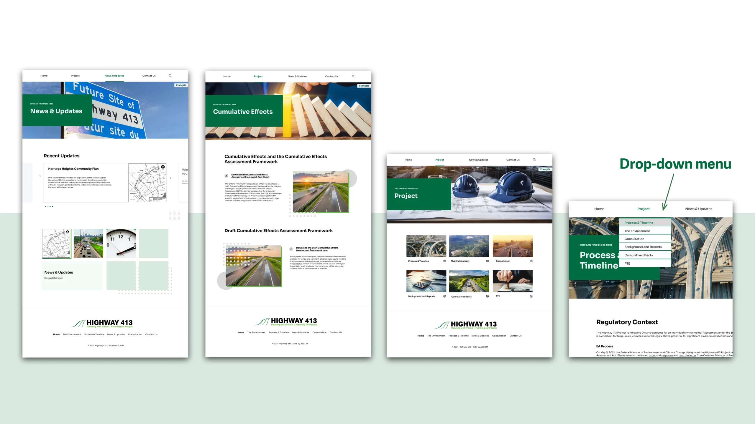
I reorganized the site based on user questions instead of project structure:
About the Project
Cumulative Effects
The Environment & PTE
Timelines, Documents & Reports
Updates & Notices
This reduced cognitive load and allowed users to navigate without understanding technical terminology.
2
Simplifying Navigation & Accessibility
I designed mobile-first wireframes to ensure:
Readable text size
Accessible interaction patterns
Logical reading order
Highlighted important actions (attend meeting, submit feedback)
Accessibility considerations included:
High contrast text
Clear headings
Structured content for screen readers
Predictable navigation
3
Document Library Redesign
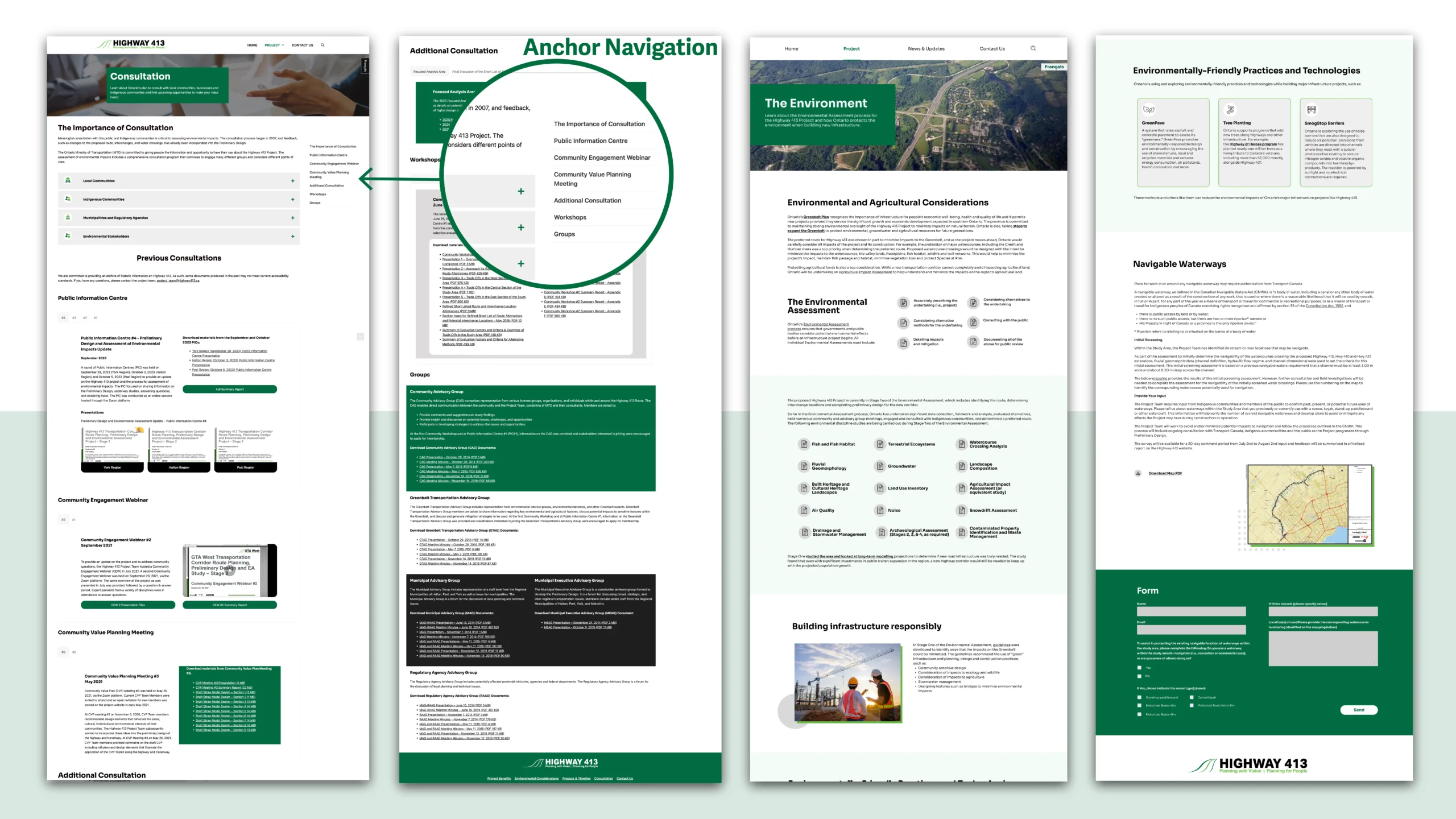
Instead of long, unstructured PDF listings, documents were:
Categorized by relevance
Organized with a side navigation system
Presented in scannable groupings
This improved information hierarchy and reduced the cognitive effort required to locate specific files.
SOLUTION
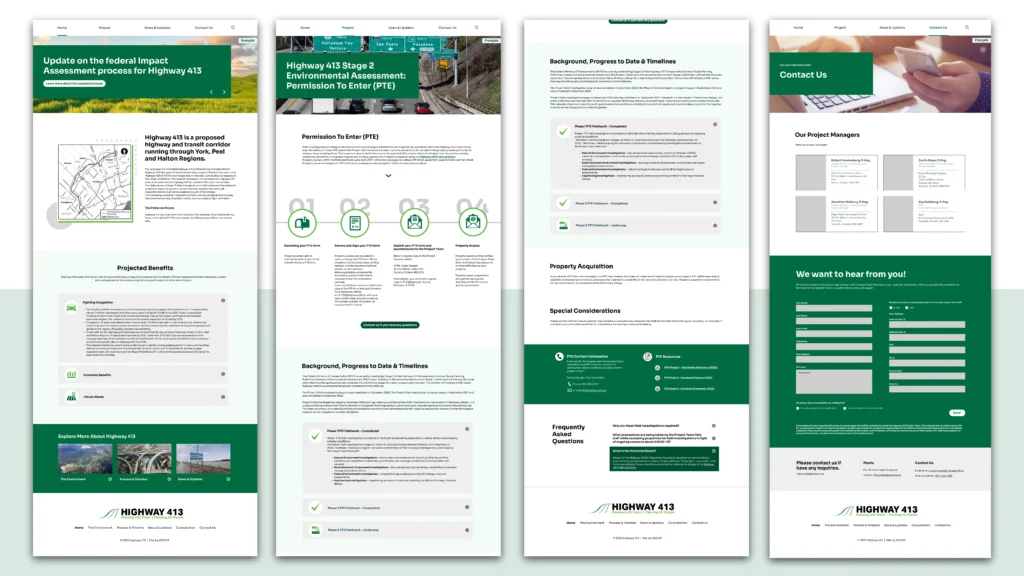
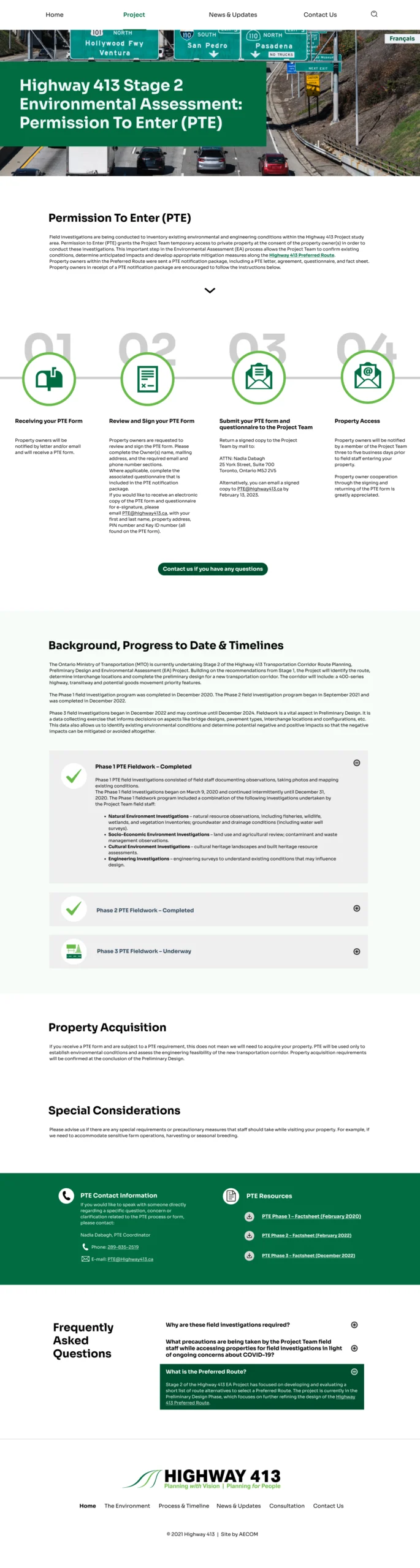
HOMEPAGE
The homepage communicates project status immediately and surfaces participation opportunities. Users can quickly see updates and upcoming engagement events without reading long descriptions.
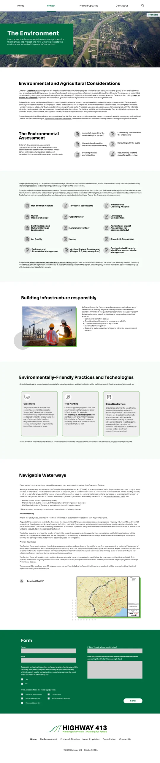
Community Impact and Contact Us Pages
Content is structured to present essential information first, using plain language summaries before directing users to technical documentation. This layered approach reduces cognitive load while still maintaining transparency.
For users seeking additional clarification, users can easily contact the organization directly through a dedicated contact page, ensuring a clear path from information to action.
Participation & Meetings
All engagement-related content, including meeting schedules, environmental assessment updates, PTE registration details, and contact methods are organized within one dedicated participation hub.
By centralizing participation-related information, users can quickly understand how to get involved and take action without navigating across multiple pages.
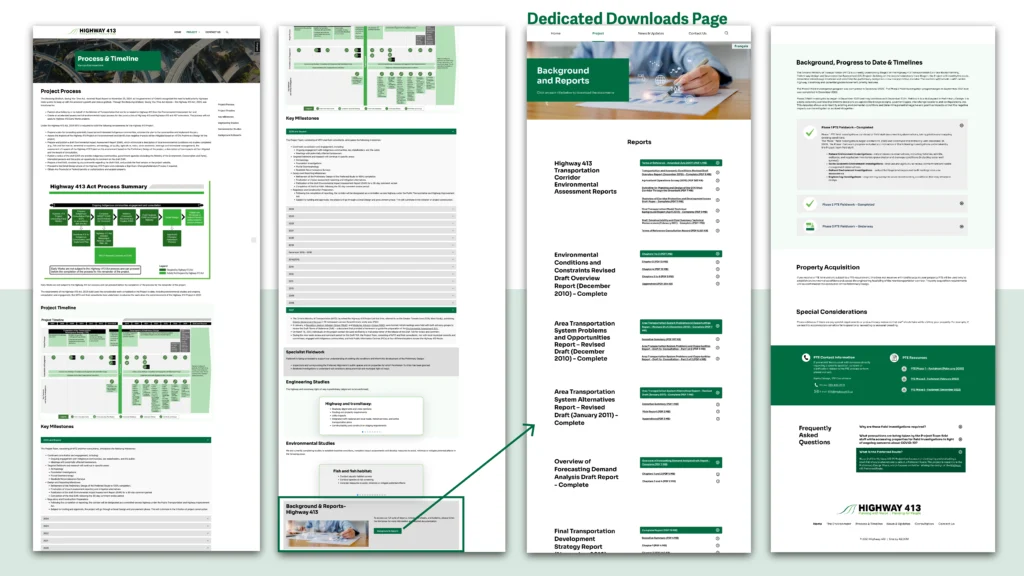
Documents Library
Instead of presenting users with long, unstructured lists of PDFs, documents are organized into clear categories with a supporting side navigation menu.
This structure helps visitors quickly understand which documents are relevant to their needs, reducing the effort required to scan and locate specific information.
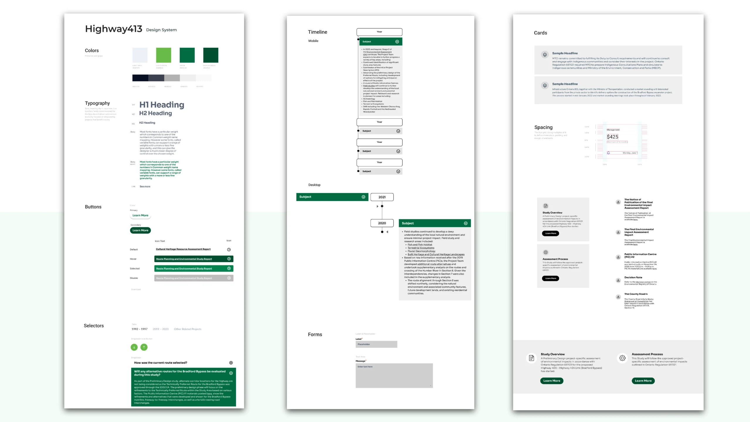
Visual System & Accessibility Decisions
Design System & Visual Consistency
To support clarity and accessibility, I developed a simple and structured visual system.
The goal was not to create a visually complex interface, but to ensure consistency, readability, and trust.
Typography
Clear heading hierarchy to guide scanning
Generous line spacing for long-form content
Consistent sizing between desktop and mobile
Color & Contrast
High-contrast combinations to support WCAG standards
Limited accent colors to highlight actions (meetings, feedback, updates)
Avoided decorative colors that could distract from content
Components
Standardized document cards
Consistent button styles for participation actions
Structured content blocks to reduce visual clutter
Result & Reflection
Impact
• Improved clarity for non-technical audiences
• Reduced confusion when navigating reports
• Supported accessible public participation
• Provided stakeholders with a reliable communication platform
What I learned
Designing for public audiences is different from designing for internal stakeholders.
Clarity, trust, and transparency matter more than visual complexity. I learned how to balance both when
Good UX in civic projects is not about aesthetics, it is about helping people understand decisions that affect their lives.
Katherine Chui
UI/UX Designer based in Toronto.
I design clear, thoughtful and human-centred digital experiences.