Case Study 2
MFFN Community Website & EA/IS Microsite
OVERVIEW
PROJECT
Homepage & EA/IS Microsite
ROLE
UI/UX Designer: Information architecture, accessibility strategy, mobile-first layouts, and visual system alignment.
TEAM
Communications leads, policy stakeholders, developers, and community representatives.
GOAL
I led the redesign and implementation of the MFFN homepage and EA/IS microsite to transform complex environmental assessment content into a clear, accessible, and culturally aligned platform that communicates community updates clearly to diverse audiences.
OUTCOME
Delivered a WCAG-informed homepage and EA/IS microsite that improved content clarity, strengthened brand identity, and supported inclusive access across devices.
KEY SKILLS DEMONSTRATED
Accessibility (WCAG)
Information Architecture
Content Simplification
Stakeholder Collaboration
THE PROBLEM
Design Challenge
The website needed to communicate dense environmental reports and community updates to diverse audiences, including residents, stakeholders, and government reviewers.
However:
Content lacked hierarchy
Navigation reflected internal structure, not user intent
Brand identity was inconsistently applied
Accessibility was not systematically integrated
The experience felt text-heavy and generic, making it difficult for users to quickly locate relevant information.
Design Approach
1 Restructuring Information Architecture
I reorganized content around user goals rather than administrative categories.
For the EA/IS microsite, long-form materials were structured into clear sections such as:
Overview
Updates
Documents
Participation
Contact
This reduced cognitive load and improved predictability.
2 Accessibility as a System-Level Decision
Accessibility was embedded from the wireframing stage.
Key considerations included:
1. Clear semantic heading hierarchy
2. WCAG-aligned contrast ratios
3. Keyboard navigability and visible focus states
4. Descriptive link labeling
5. Logical reading order for screen readers
Rather than retrofitting fixes, accessibility shaped layout and interaction patterns.
3 Mobile-First Design
Layouts were designed for small screens first, prioritizing:
1. Readable typography
2. Clear content grouping
3. Adequate touch targets
4. Reduced navigation depth
Desktop layouts expanded from a simplified mobile foundation.
4 Brand & Cultural Alignment
The visual system was refined to better reflect community identity.
The colour palette is derived from official logo assets. I used consistent application across components and a subtle leaf-pattern background inspired by the natural environment.
The goal was to reinforce identity while maintaining readability and accessibility.
Visual System & Accessibility Decisions
Design System & Visual Consistency
To ensure long-term consistency and inclusive access, I established a structured visual and accessibility system that guided layout, component usage, and content organization across both the homepage and EA/IS microsite.
Visual Framework
The visual direction was intentionally restrained to support clarity and brand alignment.
Colour palette derived from official logo assets
Consistent application of brand colours across key interface elements
Subtle leaf-pattern background referencing the community’s connection to land
Structured spacing system to improve readability
The goal was to reinforce identity without compromising accessibility.
Accessibility Framework
Accessibility considerations were embedded into both structural and visual decisions:
Defined heading hierarchy (H1–H4)
WCAG-aligned contrast ratios
Keyboard navigable interaction states
Clear focus indicators
Structured semantic layout
Descriptive link labeling
By formalizing these principles into repeatable patterns, the design became scalable and maintainable for future updates.
SOLUTION
Tools
HOMEPAGE & EA/IS PAGE
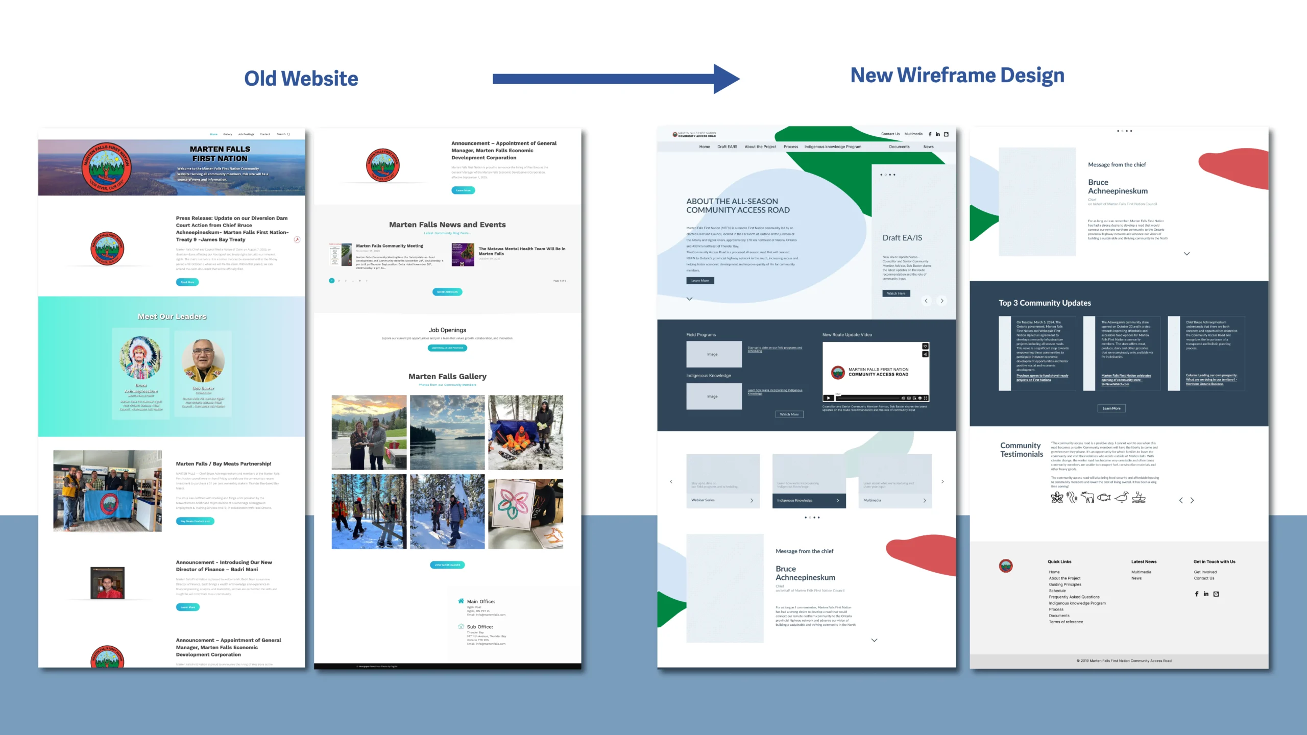
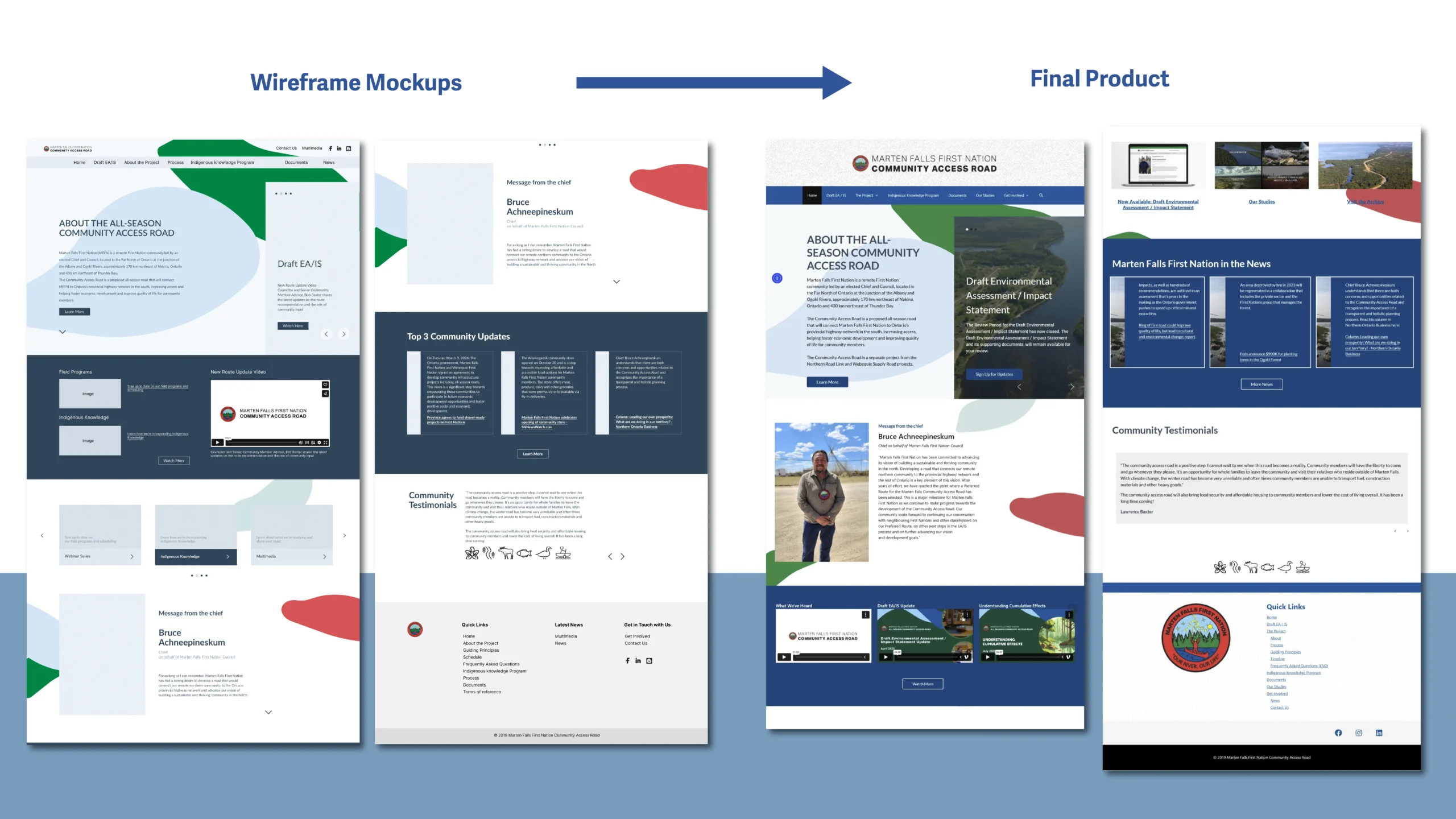
A redesigned homepage with improved hierarchy and scannability.
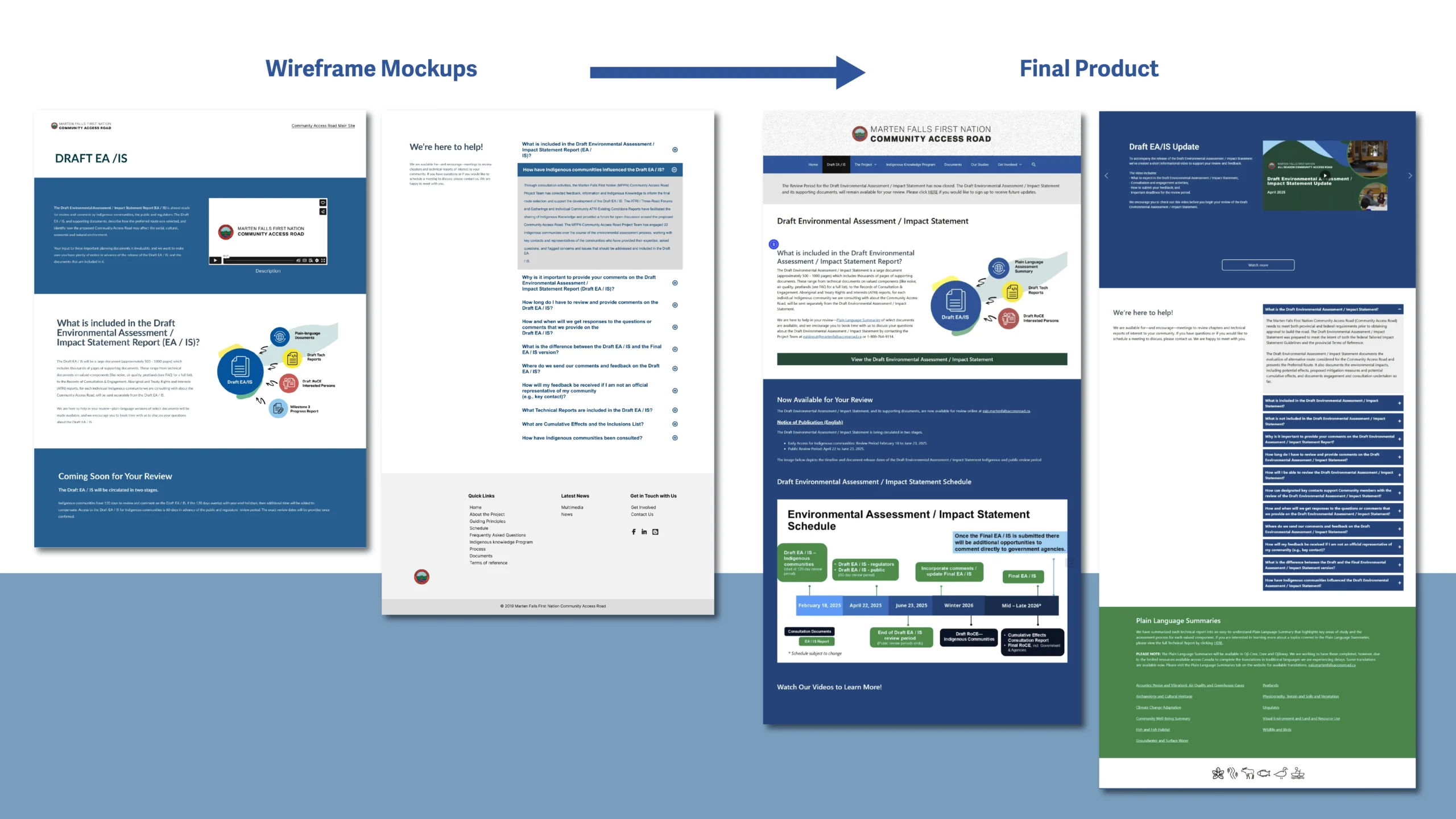
EA/IS microsite
A structured EA/IS microsite supporting layered information access.


- A refined visual system aligned with community identity
- An accessibility-informed layout framework
- Repeatable content patterns for long-term scalability
I began by developing a clean layout system in Figma, ensuring strong hierarchy, simple navigation, and compatibility with the Nation’s branding and communication goals. Once approved, I implemented the design in WordPress, structuring pages with clear sections, grouped content, and visual cues to help users easily find updates, documents, and community resources.
The microsite emphasized clarity, trust-building, and accessibility—ensuring that both community members and technical audiences could navigate the project information without confusion.
The organization adopted the redesigned direction, noting that it more clearly reflected their brand identity while improving usability and readability.
Result & Reflection
Impact
- Improved content discoverability
- Reduced cognitive friction across devices
- Strengthened accessibility compliance
- Enhanced trust through clearer structure and consistent identity
What I learned
This project reinforced that accessibility is not a feature; it is foundational. By aligning information architecture, visual hierarchy, and inclusive design principles, the website became more usable, maintainable, and representative of the community it serves.