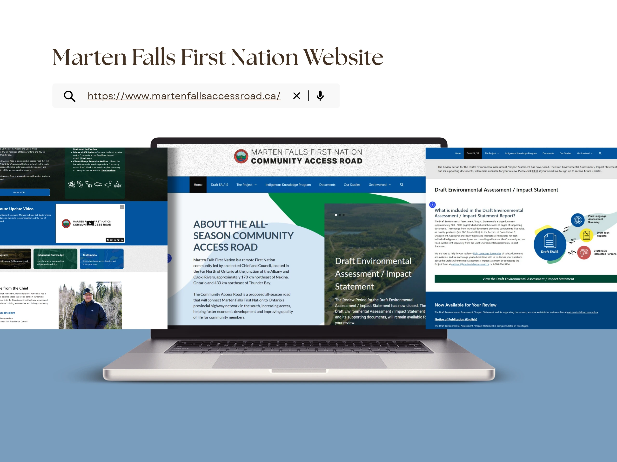
https://www.martenfallsaccessroad.ca/
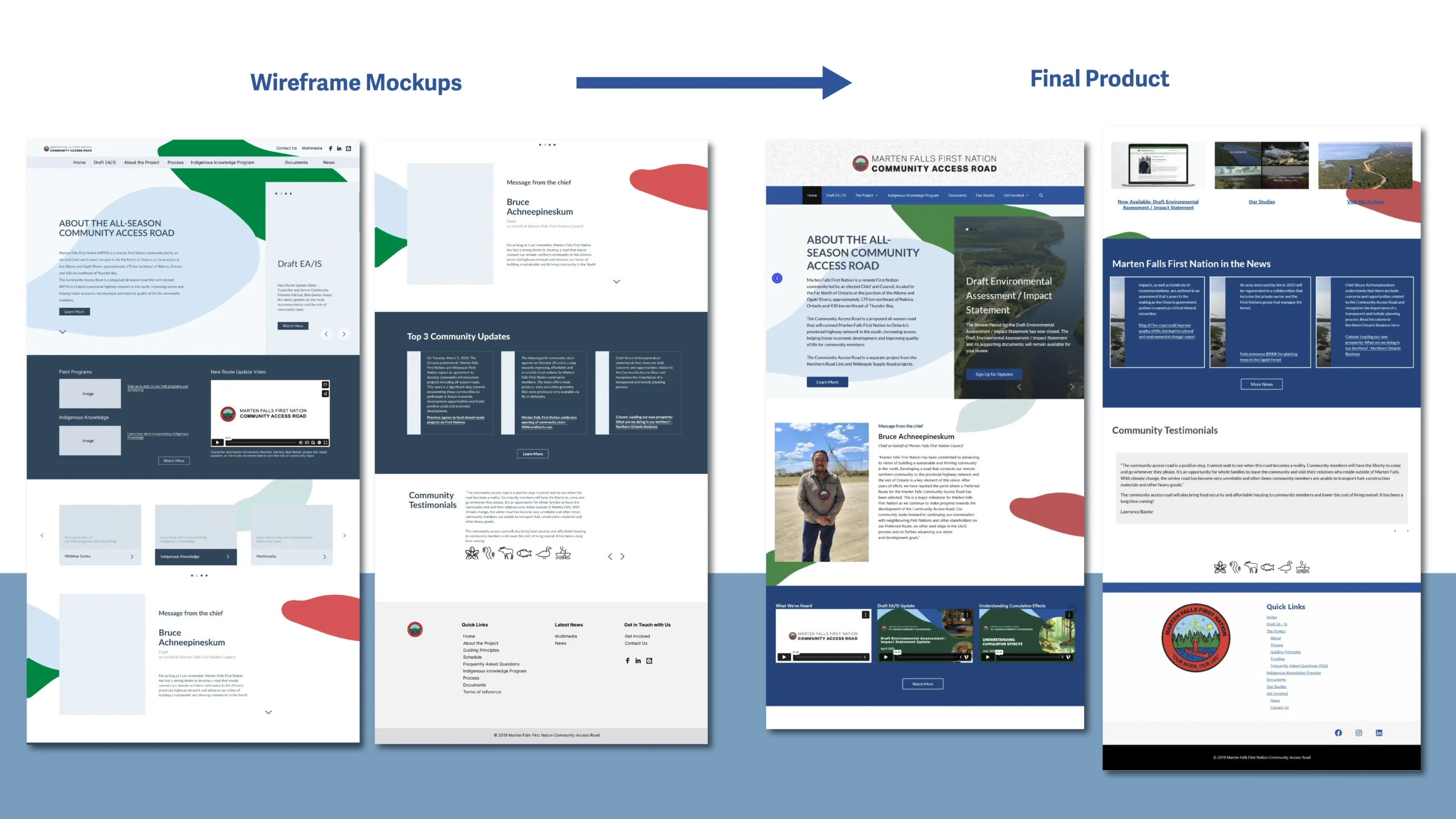
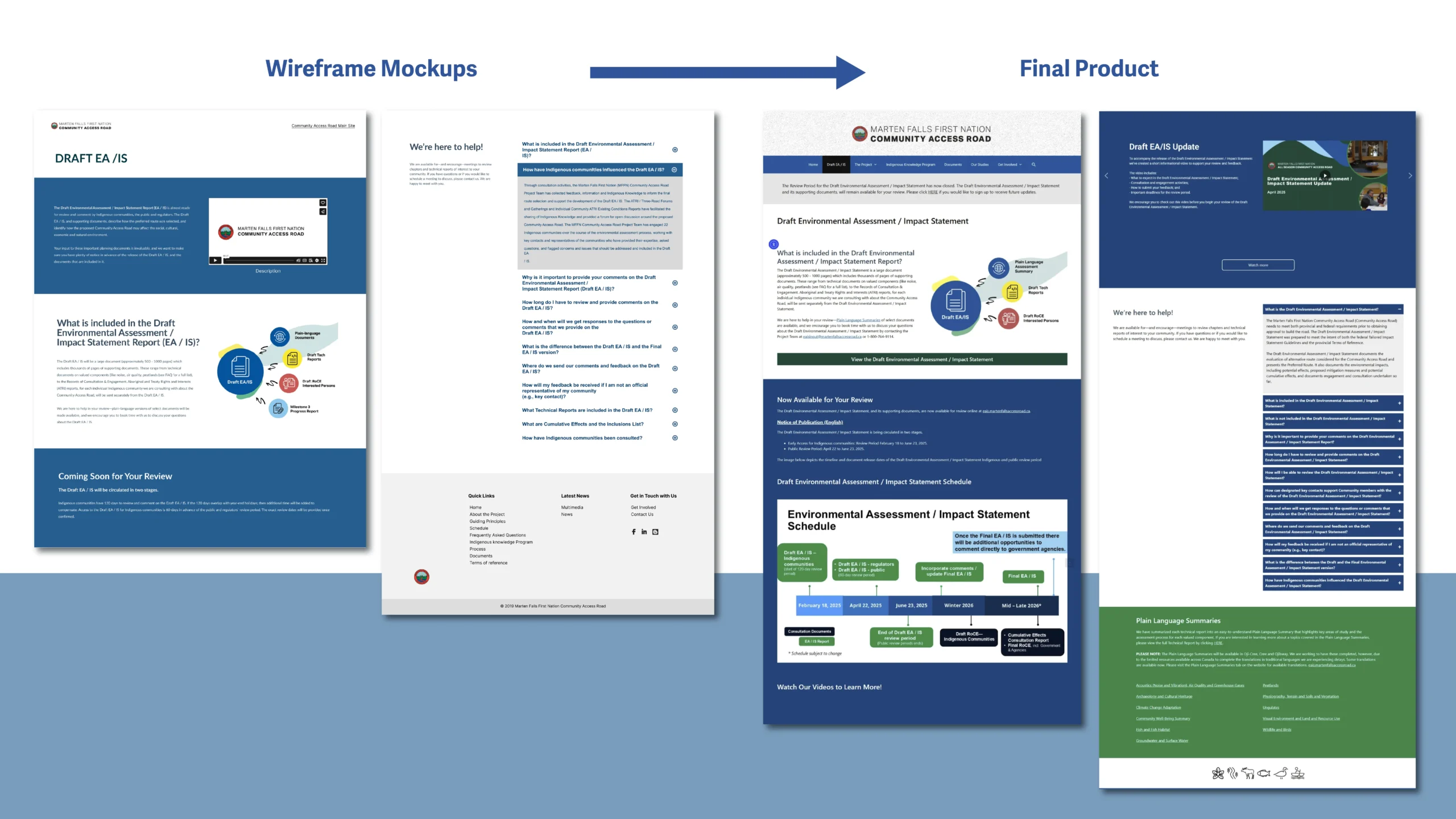
I redesigned the Marten Falls First Nation homepage and Draft EA/IS page to modernize the site and align it more closely with their community identity. The previous website was basic, lacked structure, and didn't reflect the brand colours. I introduced a refreshed visual direction using logo-based colours and a subtle leaf-pattern background inspired by the community’s natural environment. The client was very satisfied with the result and adopted the new design because it fit their brand style and communicated their identity more clearly.
The old website lacked a clear hierarchy, consistent styling, and functional components, making it difficult to find information.
Colours on the previous site did not match the Marten Falls logo or represent the community identity.
Solution 1:
I redesigned the layout from the ground up using a clear card system, visual hierarchy, and responsive sections to guide users logically through content.
Solution 2:
I developed a refreshed style direction using logo-based colours, updated typography, and consistent spacing to reinforce a unified brand presence.
UI/UX Designer
Website Developer
FIGMA and WordPress
I created a refreshed style direction grounded in the colours of the Marten Falls logo to reinforce brand identity, using logo-based colours to reinforce recognition and consistency. I introduced a subtle leaf-pattern background to reflect the natural environment of Martin Falls First Nation, creating a visually engaging and culturally resonant aesthetic.
Content is organized with card-based sections, drop-down elements, and clear visual hierarchy for easy scanning. Typography, spacing, buttons, and icons were standardized to ensure accessibility and readability across devices. The style guideline provides a flexible framework for future updates while maintaining a cohesive, professional, and community-focused look.
I designed the MFFN EA/IS microsite to provide a clear, accessible, and culturally respectful digital experience for sharing Environmental Assessment / Impact Statement updates with the public. The project required presenting technical information, community notices, maps, and reports in a way that supported transparency and meaningful engagement.
I began by developing a clean layout system in Figma, ensuring strong hierarchy, simple navigation, and compatibility with the Nation’s branding and communication goals. Once approved, I implemented the design in WordPress, structuring pages with clear sections, grouped content, and visual cues to help users easily find updates, documents, and community resources.
The microsite emphasized clarity, trust-building, and accessibility—ensuring that both community members and technical audiences could navigate the project information without confusion.