Portfolio case study
E-commerce Design for a Kitchenware Retail Platform
OVERVIEW
PROJECT
This project involved designing an e-commerce website for a UK-based kitchenware brand, enabling users to browse products and explore cooking-related content.
ROLE
UX / UI Designer: information architecture, site map, user purchase journey, wireframes, prototyping, and stakeholder collaboration.
GOAL
The goal was to create a seamless shopping experience that allows users to easily discover products, learn through content, and complete purchases efficiently. Design an intuitive e-commerce experience that simplifies product discovery, supports informed purchase decisions, and encourages conversions.
KEY SKILLS DEMONSTRATED
E-commerce UI/UX Design
Product Categorization
Conversion-focused UX
Checkout Flow Optimization
Content & Commerce Integration
THE PROBLEM
Transactional websites often require users to complete multiple steps such as browsing products, selecting options, and confirming orders.
Users needed to:
Browse a wide range of kitchen products
Quickly find relevant items
Understand product details
Access cooking-related content
The challenge was balancing shopping flow + content exploration without overwhelming users.
DESIGN APPROACH
1 Product Categorization
Organized products into clear categories to improve discoverability and reduce browsing friction.
2 Content Integration
Integrated cooking blogs into the experience to support inspiration and product understanding.
3 User Flow Optimization
Streamlined the journey from browsing → product → purchase to reduce friction and improve conversion.
4 Visual & Layout Design
Designed clean, structured layouts to highlight product information, images, and pricing clearly.
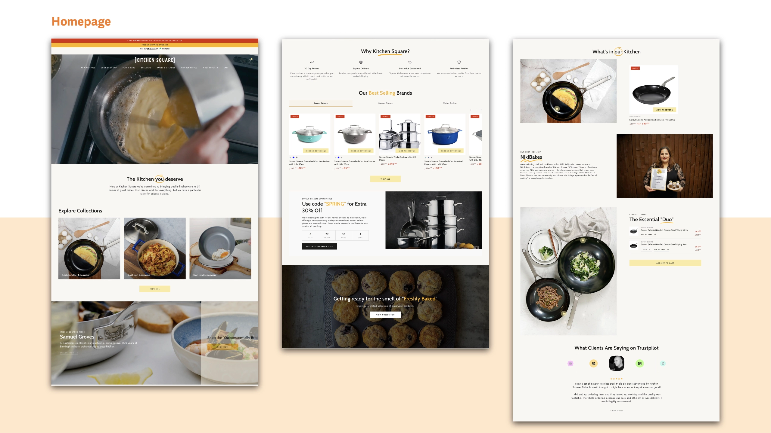
The information architecture was structured around product categories and the blog section, with on-sale items highlighted to support efficient shopping and drive engagement.
SIte Map

Style Guideline & Design System
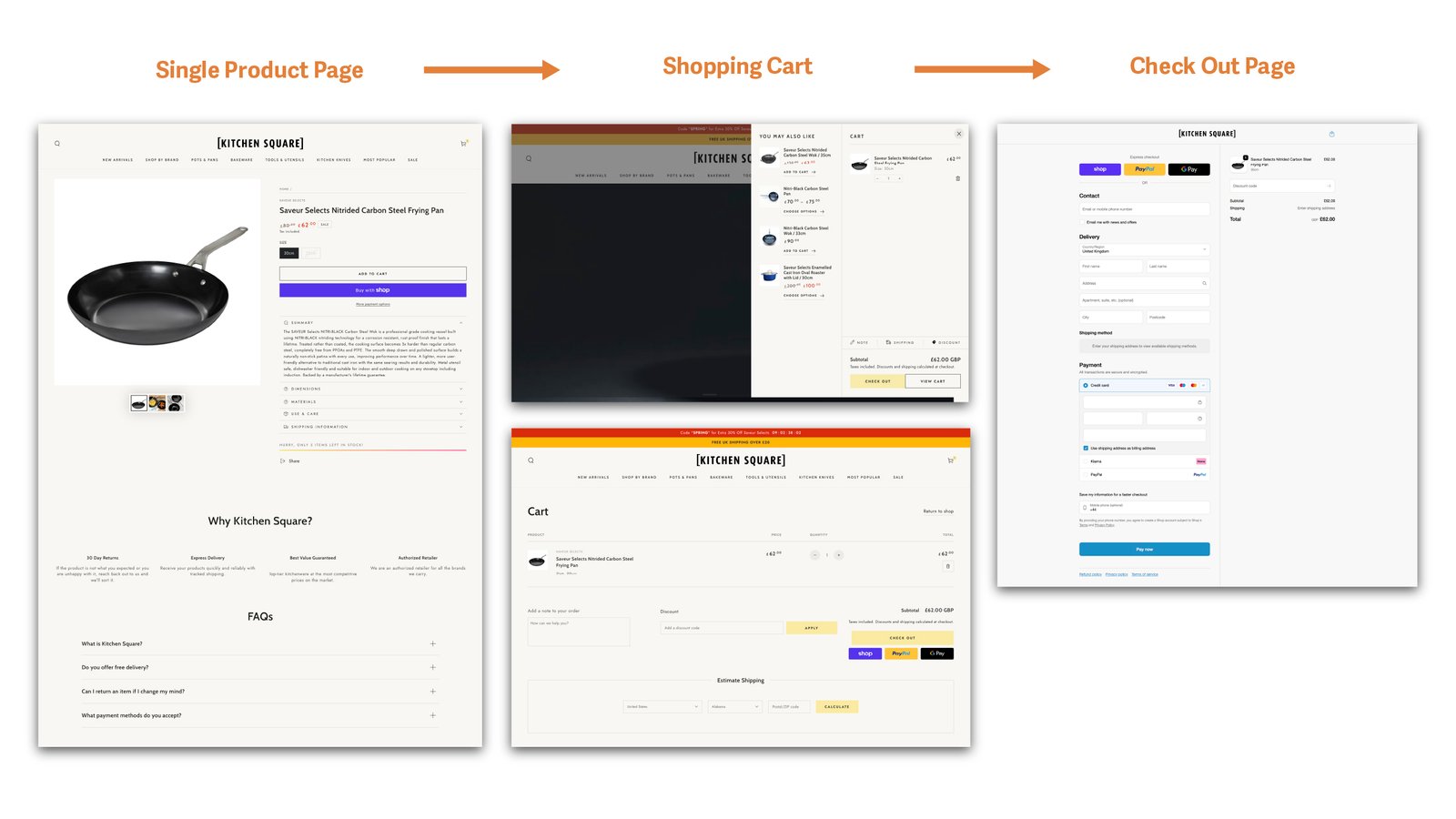
I developed a style guide to establish a consistent brand identity and designed an end-to-end purchase flow, guiding users from product discovery through checkout and post-purchase experience.
Confident, warm, chef-trusted language. "Crafted for every kitchen." Use promo urgency sparingly and purposefully.
Avoid jargon overload or discount-spam tone. Don't bury trust signals like age verification or delivery info.
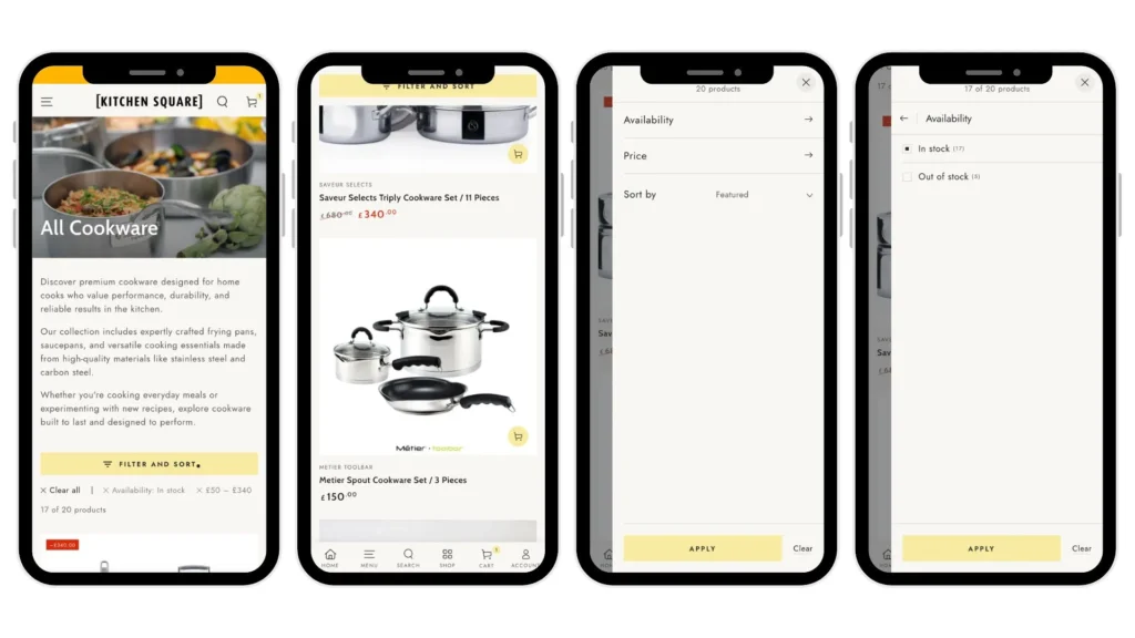
Categories / Filter Page
The “Filter and Sort” control remains fixed at the top while scrolling, enabling users to easily adjust results and continue browsing products seamlessly.
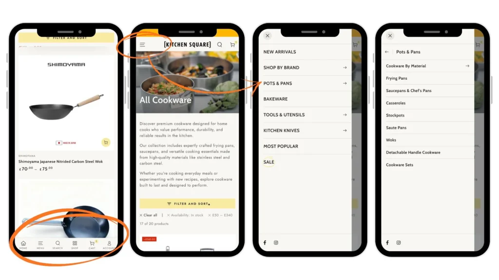
SIde Menu and Bottom Menu in mobile version
I added side and bottom navigation to the mobile version to improve accessibility and help users quickly locate specific, categorized products.
Interactive Product Showcase with Hotspots
We created a dedicated section called “The Essential Duo” to showcase products through an interactive photo with hotspots. When users hover over each product name, the corresponding hotspot appears on the image, helping them quickly understand the product’s look, size, and function in context. The on-sale price is also displayed alongside for easy reference.
Final Product
I incorporated a limited-time promotion section on the homepage to drive urgency and added a persistent promo code banner to boost visibility and engagement. The design was optimized with responsive layouts to ensure a seamless mobile browsing experience.
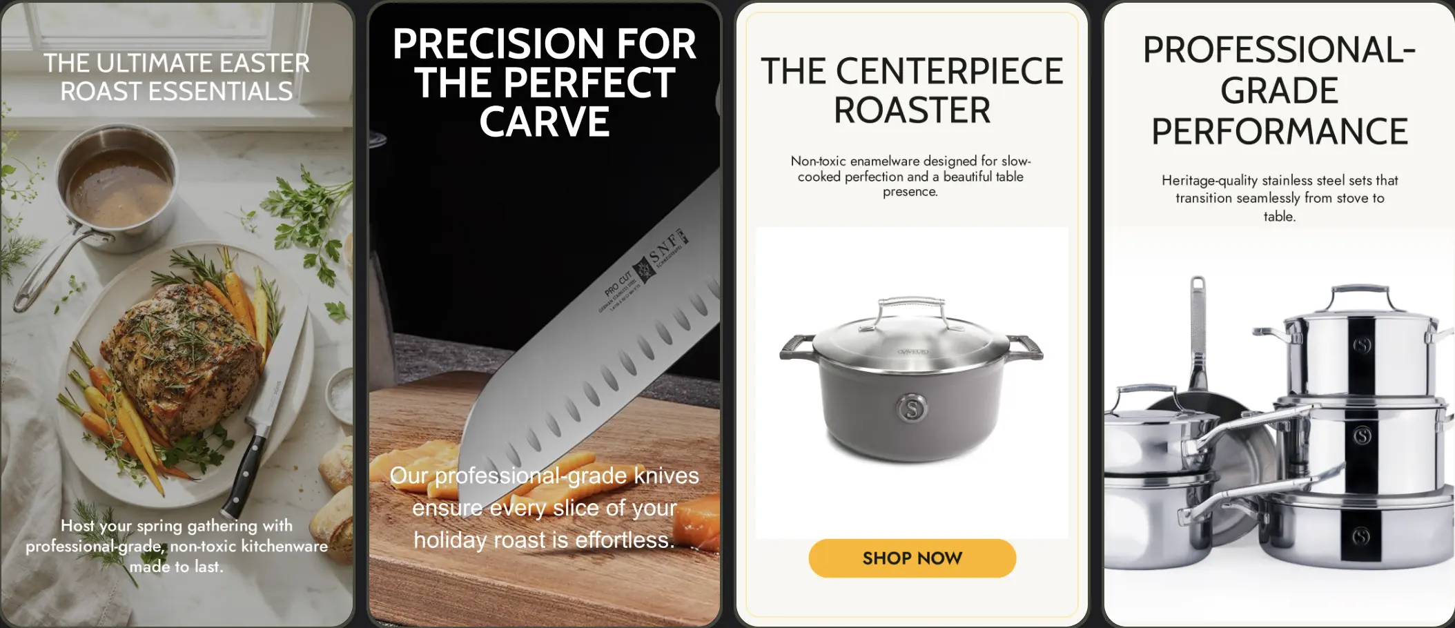
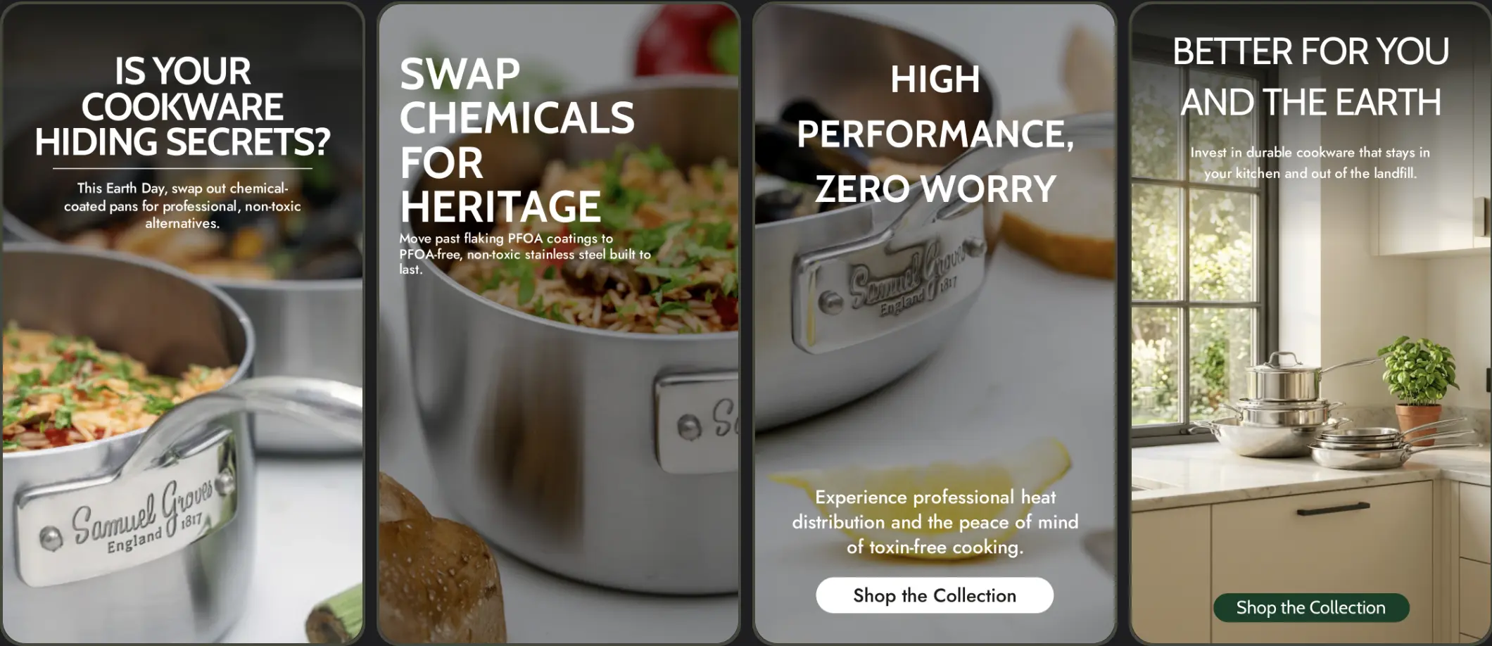
Social Media Post
I used Google Studio to come up with promotional post ideas and also created a Shopify CMS maintenance guide to help clients manage their sites after launch.
Result & Reflection
Outcome
The platform improved product discoverability and created a more seamless shopping experience by combining content and commerce in a structured way.
What I learned
This project strengthened my ability to design e-commerce experiences that balance product discovery and content. I learned how clear categorization and structured layouts can significantly improve usability and support purchase decisions.