Highway 413 Website
Project details
Description
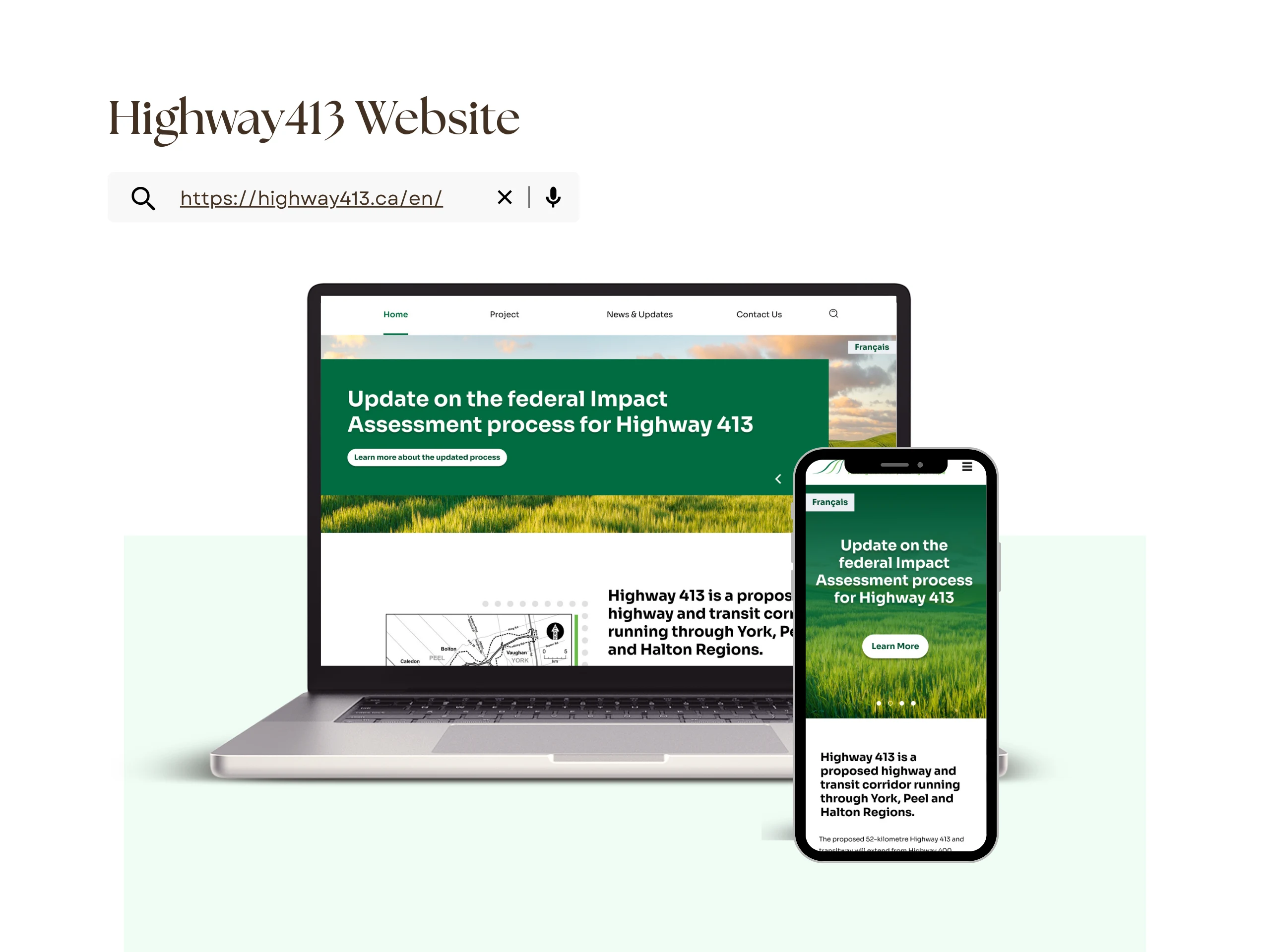
https://highway413.ca/en/
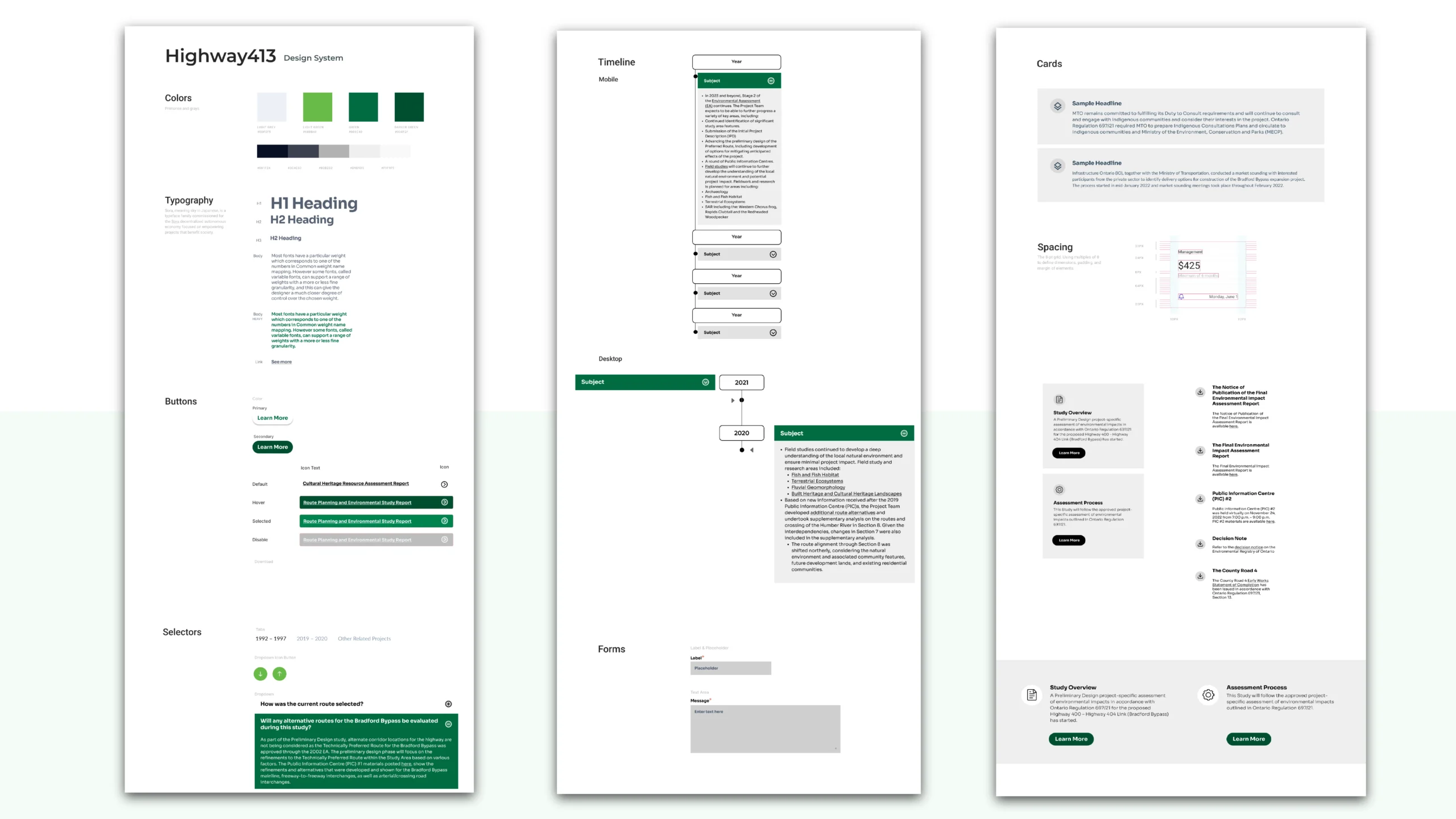
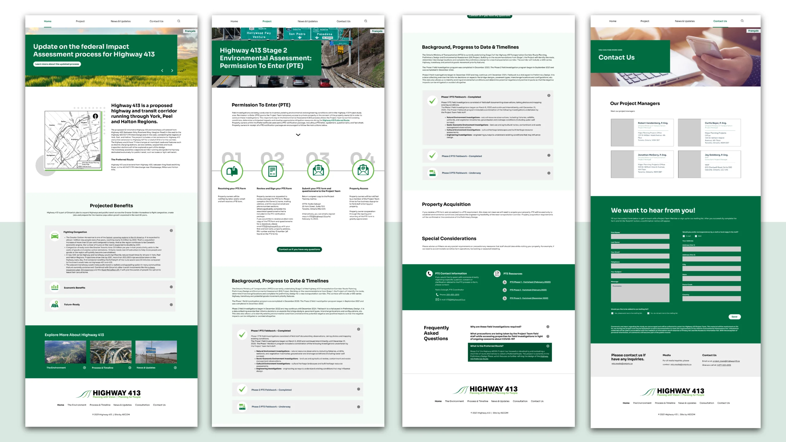
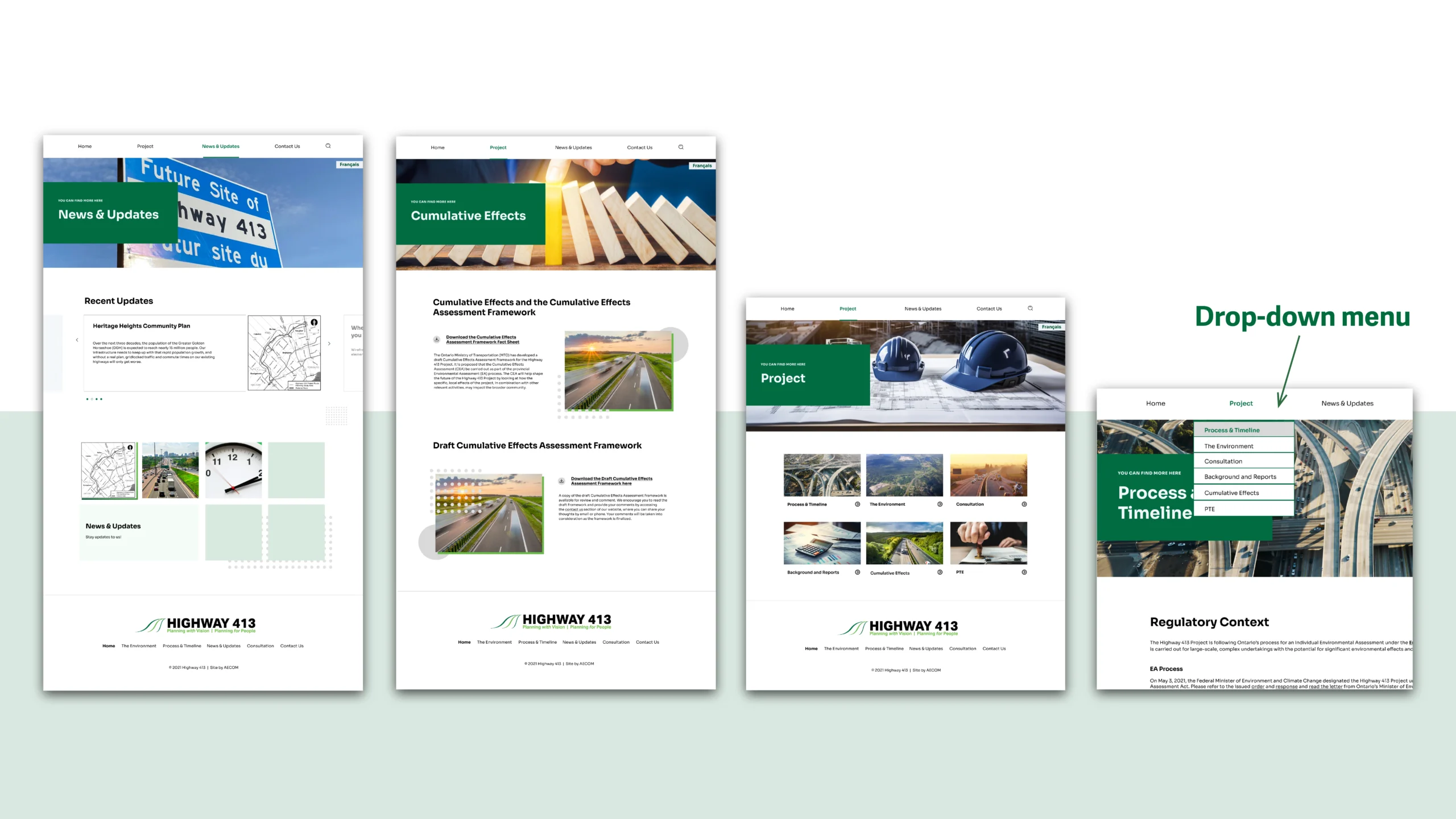
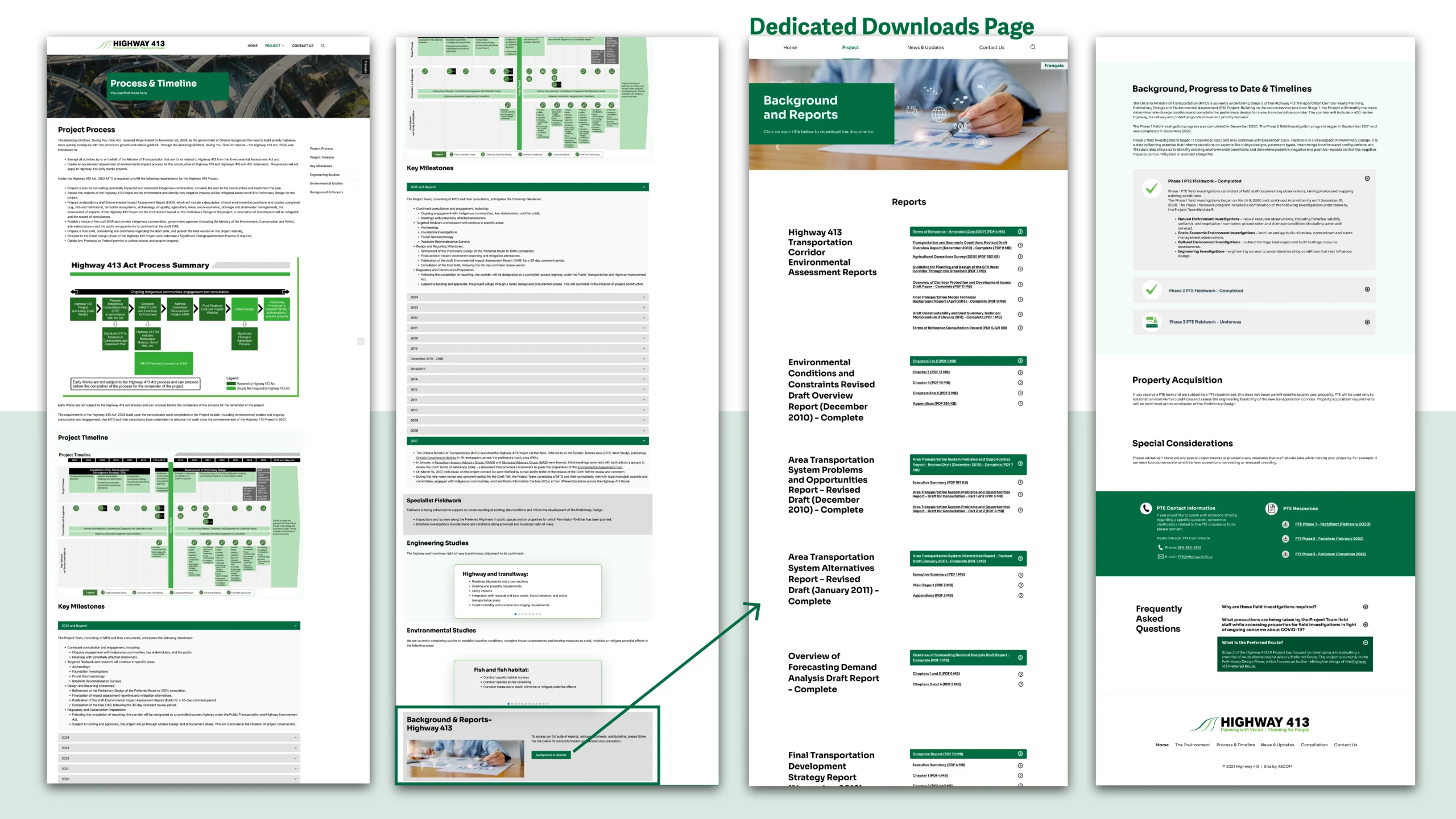
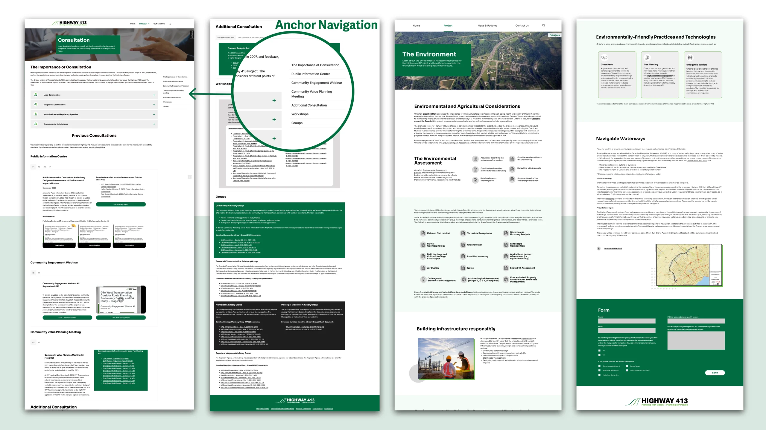
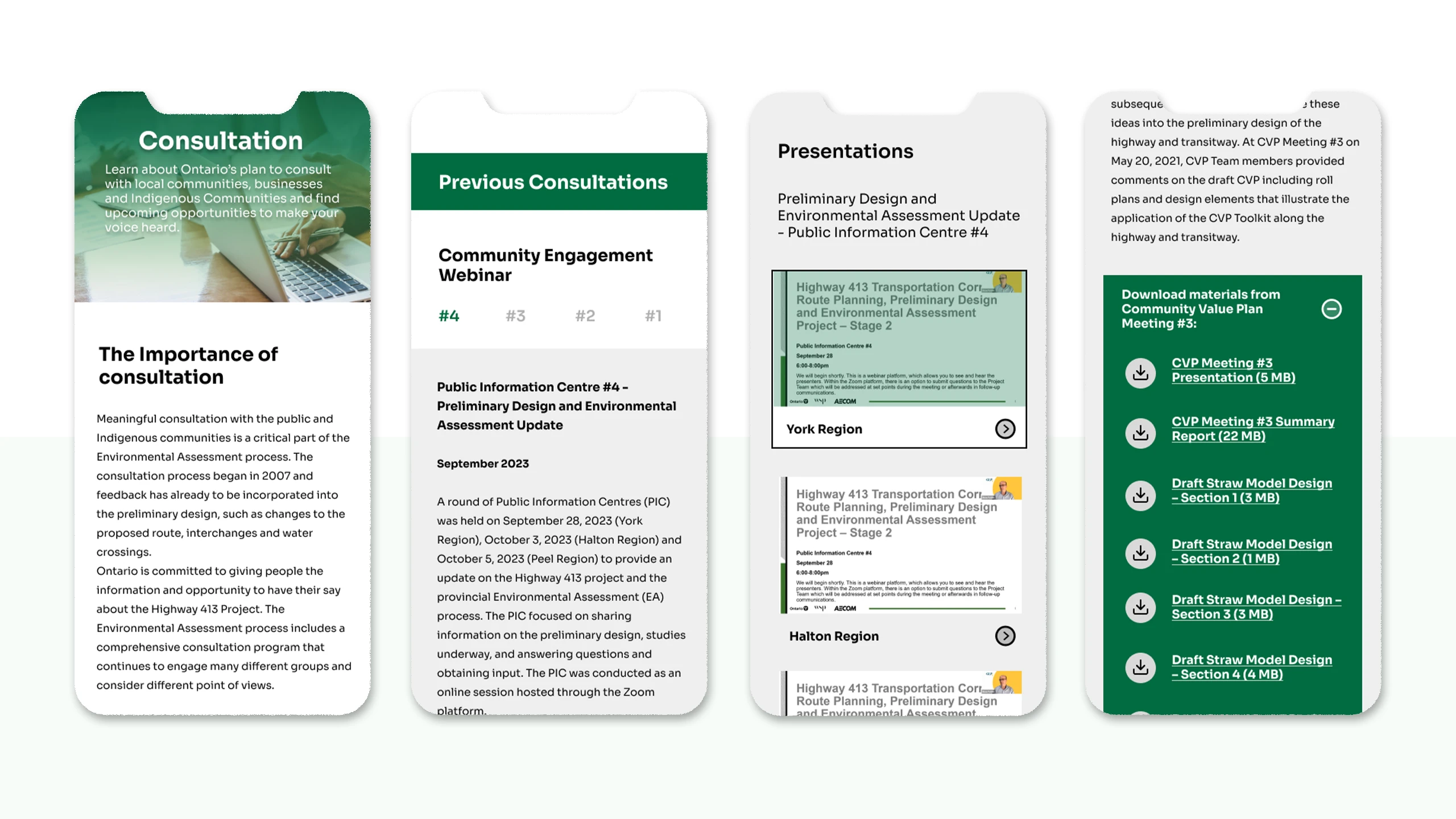
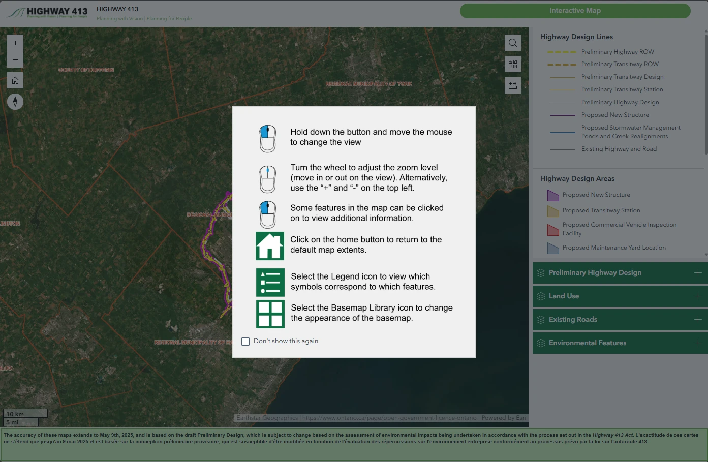
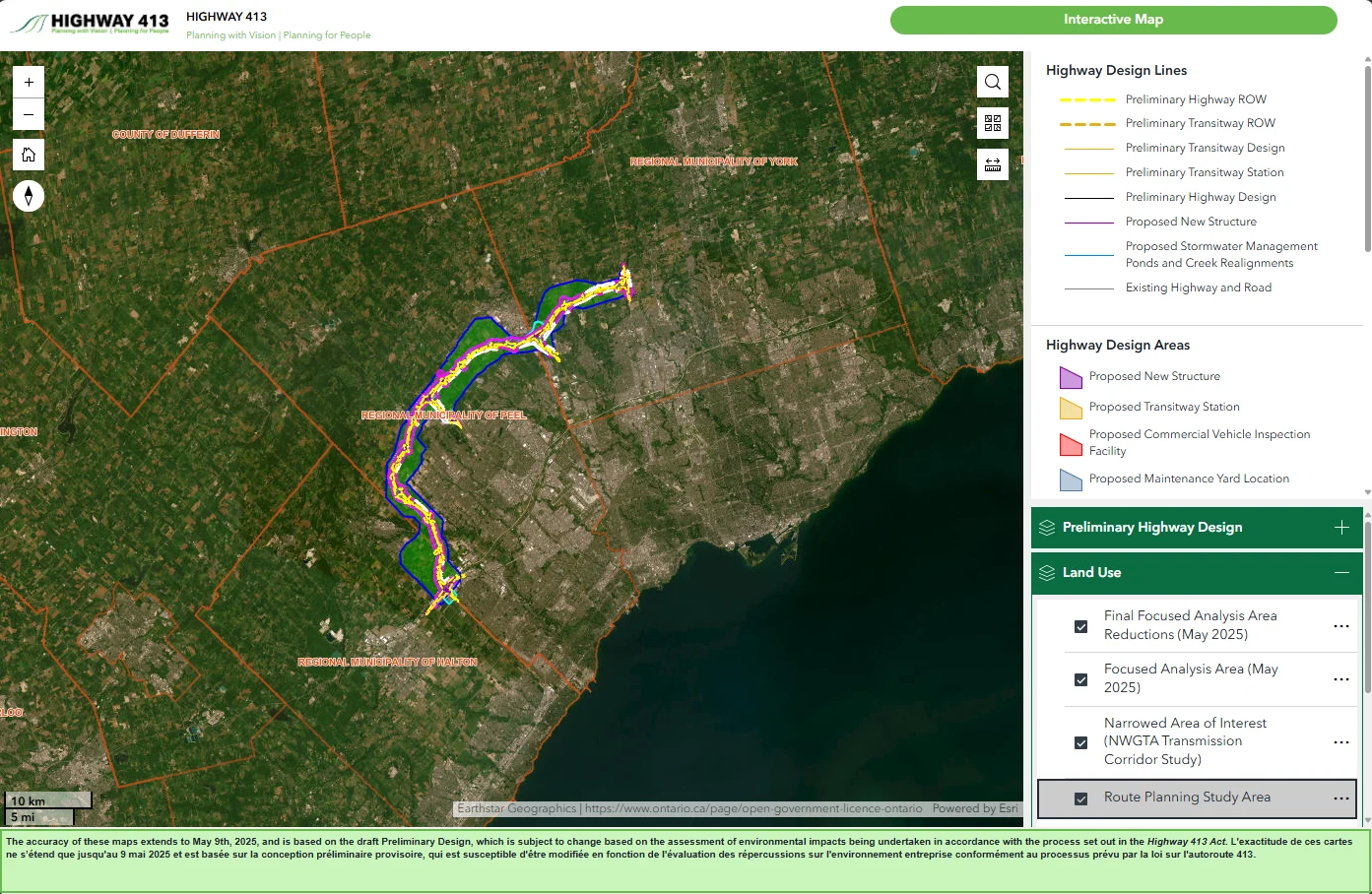
Designed the Highway 413 website in Figma and built it using WordPress, following the Ministry of Transportation’s branding and accessibility standards. The site presented a large volume of studies, reports, and project timelines, requiring a clear content hierarchy and intuitive navigation.
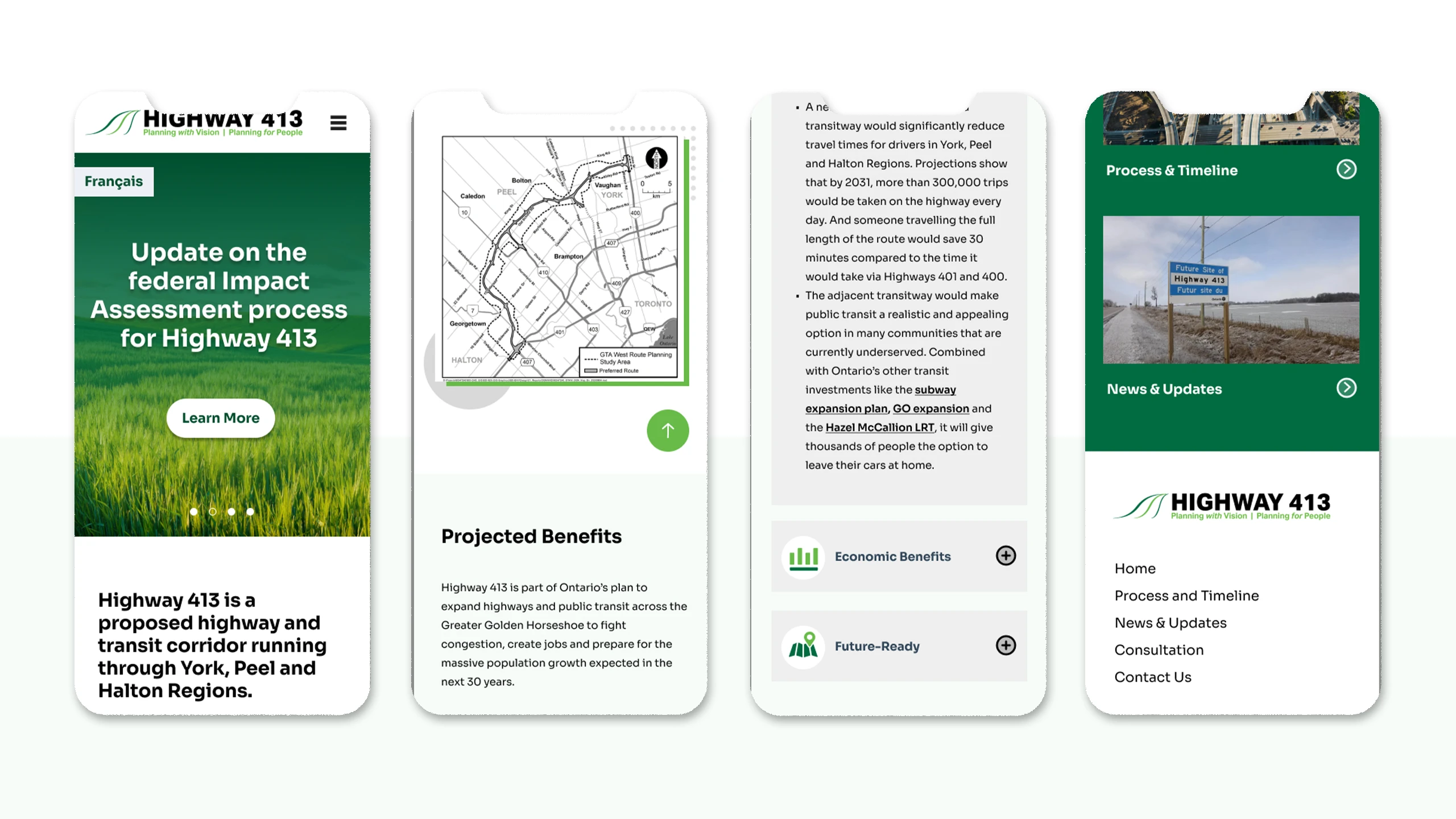
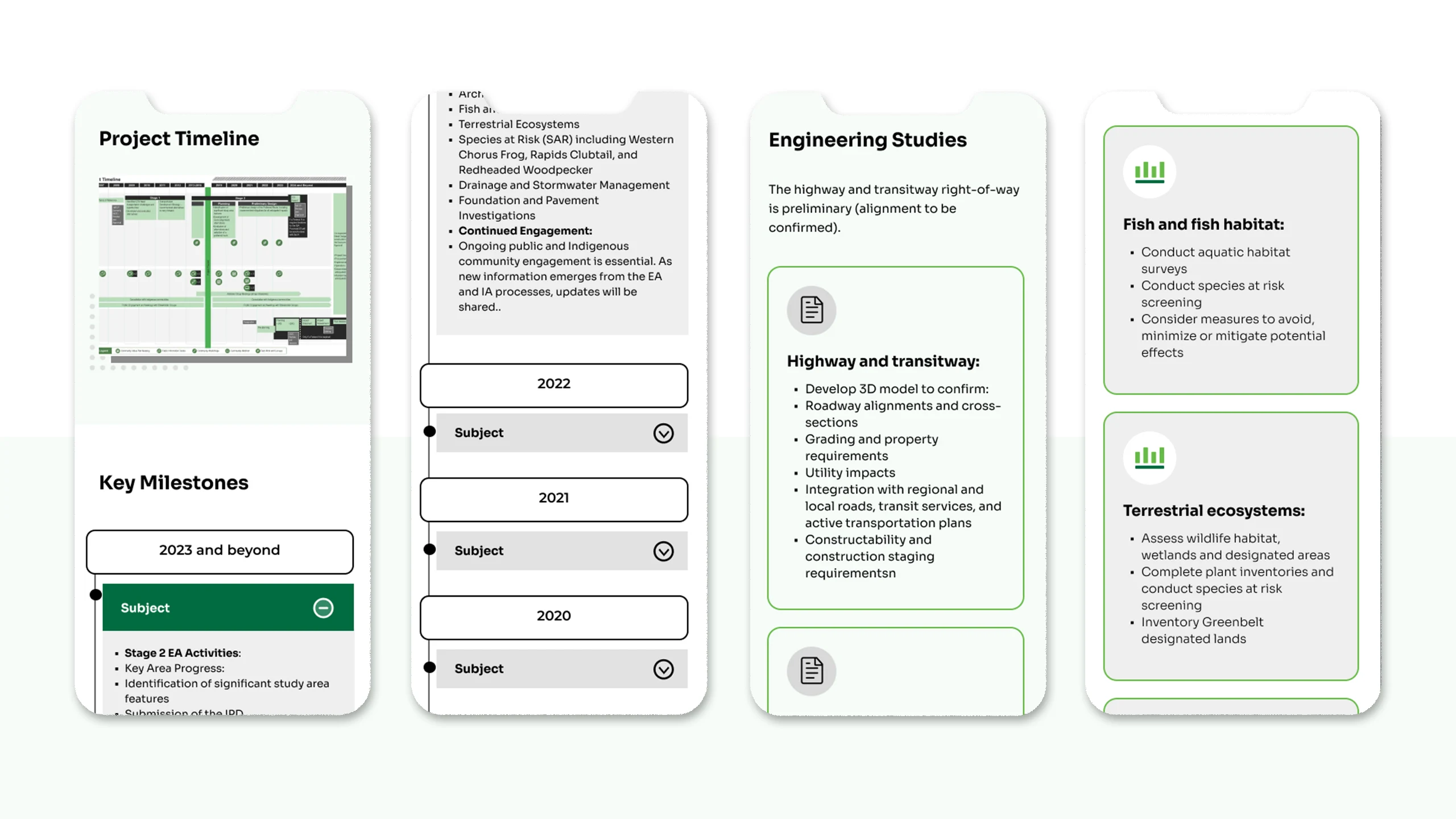
To improve usability, I implemented categorized tabs, a dedicated downloads page, and side one-page menus for content-heavy sections, allowing users to quickly locate information without being overwhelmed. I also created responsive mobile layouts to ensure a seamless experience across devices. This project enhanced public access to critical project information and received positive feedback from stakeholders and the community.
-
Status:
Completed -
Client:
MTO -
Location:
Canada
Progress and Challenges
One of the main challenges in this project was organizing and presenting a large volume of technical reports and timelines without overwhelming users. The content came from multiple departments, each using different formats and naming conventions, which made consistency difficult to maintain.
Solutions
To address this, I conducted a content audit to categorize and prioritize information, then designed a tabbed structure and one-page side menu to simplify navigation. Another challenge was optimizing performance and responsiveness on WordPress while keeping accessibility compliance. Through iterative testing and layout refinements, I achieved a clear, user-friendly design that balanced visual clarity with technical efficiency.
Role
UI/UX Designer
Website Developer
Tool
FIGMA AND WordPress
Style Guideline
At AECOM, I led the UI/UX design for several government websites using Figma and WordPress, focusing on accessibility, responsive design, and coordinating with different stakeholders across regions. At the beginning, I set clear briefs and visual checkpoints throughout the process, starting by understanding the brand’s values and target audience, then building consistent visual systems across websites and marketing materials. I also partnered with developers to ensure pixel-perfect and responsive implementation.
I began by establishing a style guideline that aligned with the project’s existing branding, logo, and highway signage colors to strengthen public recognition and consistency across communication materials. Using these foundations, I created a clean, accessible layout that clearly presented project updates, maps, and reports for public engagement.
Once the design direction was approved, I started designing the Highway 413 website in Figma and developed it using WordPress, ensuring alignment with MTO’s branding and accessibility standards. The site contained a large volume of studies, reports, and project timelines, so I implemented clear sections, categorized tabs and a dedicated downloads page to help users quickly locate relevant documents.
I also good at organizing and simplifying complex information to support B2B services. For example, in this case, I restructured the site with categorized tabs and drop downs and add a separated downloads page, helping both stakeholders and the public easily find what they needed and improving the overall experience.
One of the main challenges was managing an extensive amount of content — including reports, studies, and timelines — while maintaining a clean and accessible layout. The large volume of information caused long scrolling issues, so we implemented a sticky anchor menu to improve navigation and help users jump between sections efficiently.
I also created responsive mobile layouts to provide a seamless experience across all devices. The final design enhanced public access to project information and received positive feedback from both stakeholders and community users.
Additionally, I helped develop an interactive project map using ArcGIS, allowing users to explore project areas and understand potential impacts in an engaging, visual way. I incorporated colour-coded indicators, labelled shapes, and clear instructions to enhance user understanding. To improve readability and convenience, I also added collapsible sections for different regions, making it easier for users to focus on the information most relevant to them.